Close

Designers on the Modern Kitchen: Warmth, Character, and Current Trends


Designers on the Modern Kitchen: Warmth, Character, and Current Trends
Across the country, kitchens are evolving into the most emotionally resonant spaces in the home—places that support routine and ritual, make guests feel welcome, and reflect the personality and values of the people who use them. As homeowners seek environments that feel comforting, grounding, and connected to nature, designers are meeting the moment with kitchens that balance sophistication and heart, as seen in the Kitchen & Bath Design Show and the International Builders’ Show this year.
This month, we’re highlighting eight designers whose projects reveal a consistent movement toward kitchens that are modern but warm, refined but personal, functional but emotionally attuned. Their projects show two primary design stories: the rise of warm modernism, where bold palettes meet natural materials and lived-in comfort, and character-driven kitchens rooted in history, lifestyle, and narrative.
Together, they offer a window into the future of kitchen design for 2026 and beyond.
The Rise of Warm Modernism
Modernism has taken a gentler turn. Instead of stark minimalism, these designers are embracing contrast softened by wood, nuanced whites, sculptural details, and richly layered lighting. The result is a modern aesthetic that feels warm, grounded, and deeply livable.
Jamie Gasparovic of STUDIO GASPO transformed a spec home kitchen into a bold, inviting centerpiece. The foundation is a dramatic sweep of Tricorn Black SW 6258 (251-C1) cabinetry, balanced with white oak flooring and a vertical slatted hood that Jamie describes as “functional art.”


“All-black kitchens can easily feel cold or trendy, so the key is layering,” she explains. Wood textures, organic décor, and warm undertones ensure the palette remains grounded rather than austere. The overall effect aligns naturally with the Restorative Darks family in our 2026 Colormix® Forecast—confident, mood-setting tones balanced by light and natural materials.
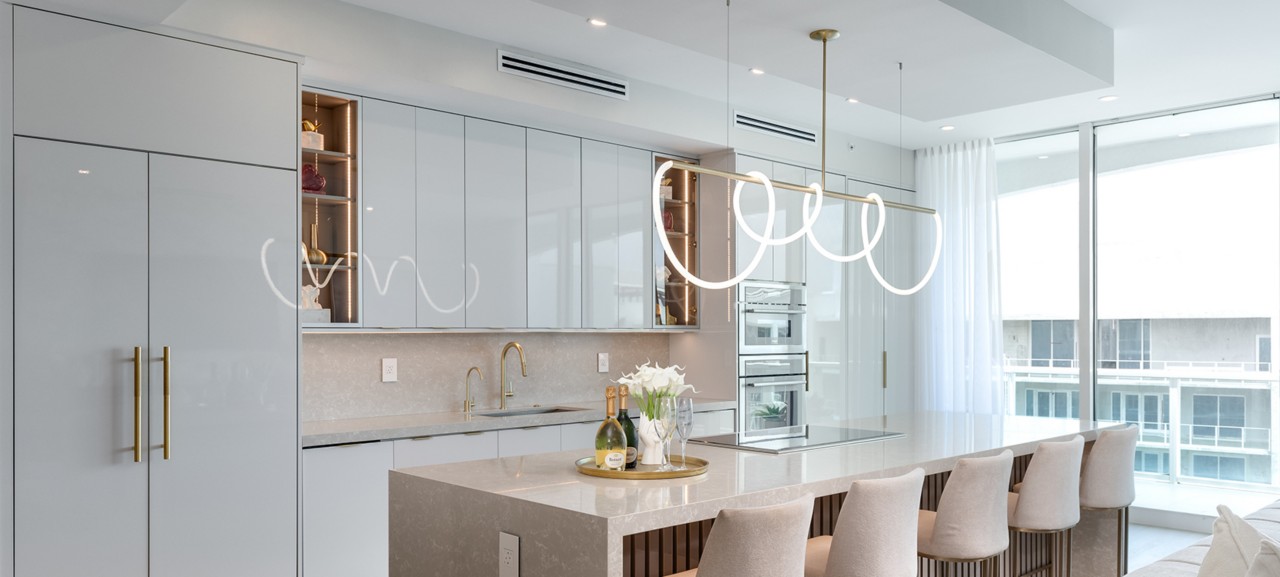
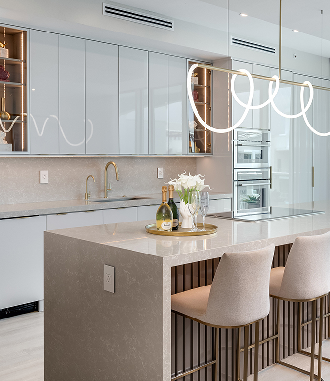
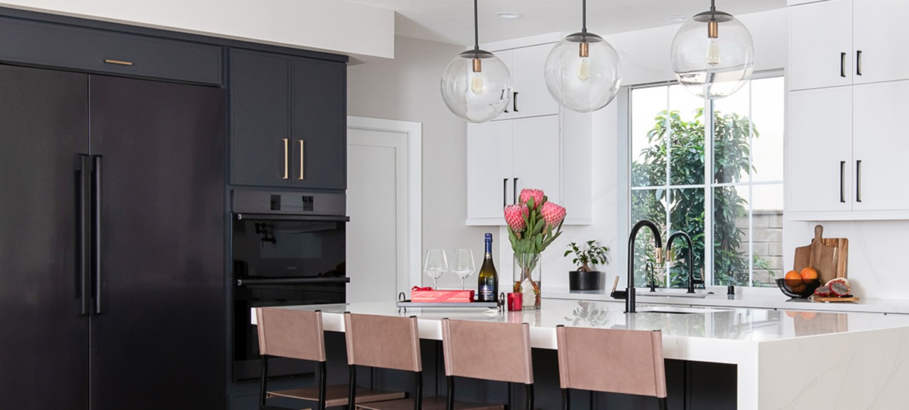
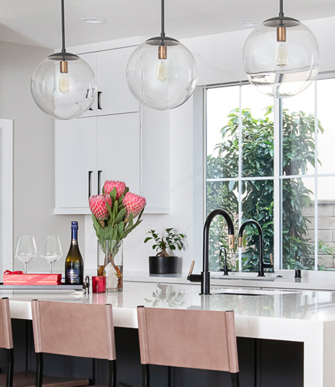
For Sea Pointe Design & Remodeling, a family of four needed a kitchen that could serve as both an everyday workspace and a social hub. The clean, modern foundation of iron and white cabinetry could easily have skewed too minimal, but the paint palette—selected after testing across multiple walls and light levels—brought essential warmth.
“Agreeable Gray SW 7029 (243-C1) was the clear winner,” alongside the crisp clarity of High Reflective White SW 7757 (256-C1), their designer notes. These tones soften the architecture while highlighting natural materials and the home’s open flow. The result is modern design that never feels clinical.


Detroit designer Sabrina Raso Vaughan approaches warm modernism with a sharper edge—cool, refined, and confidently minimalist. Her full remodel blends Allegory SW 9553 in the pantry with Ice Cube SW 6252 (257-C3) in the kitchen and accents of Tricorn Black SW 6258 (251-C1) to create a palette that feels intentional and engaging.
Sabrina sees this blended approach as increasingly relevant: “It’s functional and comfortable, but still creative. Homeowners want spaces that feel expressive without sacrificing usability.” Her project demonstrates that restraint can still leave room for character.


In Asheville, North Carolina, Susan Chancey built a kitchen around the tonal balance of shadow and natural warmth. “This kitchen was designed for clients who wanted a space that balanced everyday functionality with an elevated, warmly modern aesthetic,” she says. “They desired a kitchen that felt connected to the home’s mountain setting—rooted in natural materials but polished enough for entertaining. We achieved this by grounding the cabinetry in Sherwin-Williams Iron Ore SW 7069 (251-C7), a deep, sophisticated neutral that adds quiet drama without overwhelming the room. To soften and balance the richness of Iron Ore, we paired it with knotty alder cabinets in a custom greige stain, bringing warmth, movement, and organic texture into the palette. Every detail—lighting, work zones, materials, hardware—was designed to support a kitchen that is both stunning and deeply livable.”


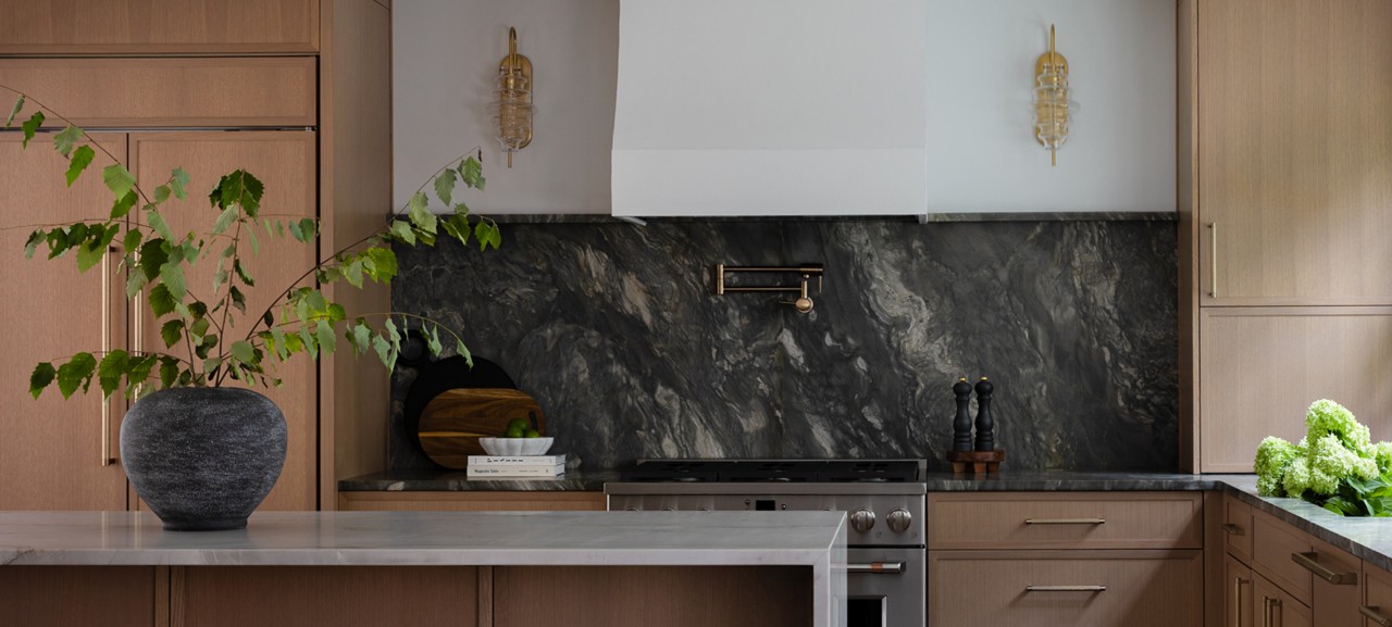
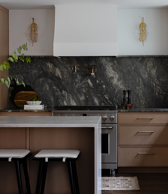
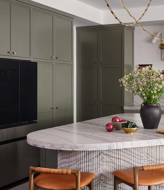
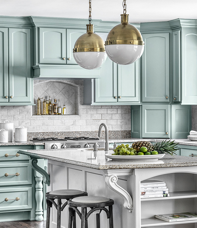
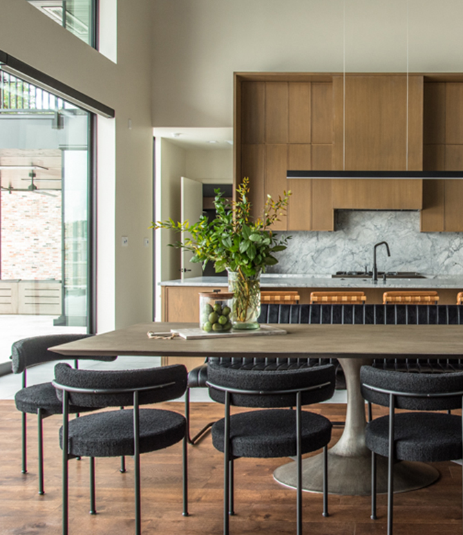
Jennifer Kowalski of Six Walls Interior Design approaches modernism through livability. Her clients, a young family with an active household and a passion for hosting, needed a kitchen that could serve as a command center, gathering space, and visual anchor for an open floor plan. Warm oak floors set a welcoming tone, while reflective tile and statement lighting introduce contrast and clarity.
Color selection was critical. After reviewing “every white on the market,” Jennifer chose Alabaster SW 7008 (255-C2) as the whole-home unifier. “It was the perfect complement to every finish—the one color that made everything else sparkle,” she says. The palette reflects a growing preference for warm whites and nuanced neutrals—tones that pair beautifully with expressive wood and stone.


Photo by Andrew Giammarco.
For Samantha of Samantha Rachel Interiors, her featured kitchen embraces the depth and comfort of a layered, organic palette. Cabinetry finished in the saturated green of Pewter Green SW 6208 (217-C6) and the soft warmth of Greek Villa SW 7551 (254-C1) sets a welcoming foundation, while accents of Caviar SW 6990 (251-C2) introduce a crisp, contemporary edge. The walls, painted in Drift of Mist SW 9166 (238-C2), offer a subtle backdrop that allows the palette’s richness to unfold without overwhelming the space.


“Warm, grounded kitchens are having their moment,” Samantha notes. “Designers are leaning into deep greens, rich burgundies, and cozy taupes—tones that make a kitchen feel instantly welcoming and timeless.”
Her perspective underscores a broader movement away from stark all-white kitchens and toward custom, collected palettes that feel personal and enduring.


Character-Driven Kitchens Rooted in Story
Other kitchens derive power from narrative—honoring architecture, celebrating personal history, and shaping spaces around the rituals that matter most. These projects feel intimate, expressive, and distinctly connected to the homeowners they serve.
Designer Charlene Mathew created a serene, Scandinavian-inspired kitchen for empty nesters seeking a home that felt calm, bright, and connected to nature. Guided by the idea of ljus (Swedish for “light”) she selected a palette anchored in Cotton SW 9581—a color scheme reminiscent of our Foundational Neutrals palette from our 2026 Colormix® Forecast.


Natural limestone, wood, and artisan-blown green glass pendants bring depth and sensory appeal. Charlene believes this direction reflects broader shifts: “Accessibility, comfort, and low maintenance seem to be on the necessity list for most people. Vast numbers of homeowners are also looking for natural materials to create a sense of calm at home.”
In Coldwater, Mississippi, Emily Chastain approached her ranch remodel by honoring the home’s original character. Her clients’ collection of vintage oil lamps became the starting point for the entire design. Soft blue cabinetry in our 2024 Color of the Year, Upward SW 6239 (224-C1), provides a nostalgic foundation, anchored in our Frosted Tints family from our 2026 Colormix® Forecast, while layered textures and rich wood tones create warmth and authenticity.


“I think bolder colors are going to continue emerging,” Emily says. Jewel tones, plum, and maroon are showing up more frequently in her work—a contrast to the all-white kitchens of the past decade. Her project proves vintage influence can feel fresh, intentional, and deeply personal.
Trends Shaping the 2026 Kitchen
Across all eight designers, several design currents appear again and again—signals of where kitchens are headed next.
Natural Woods and Authentic Materials
Greige stains, knotty alder, warm oak flooring, and expressive natural stone create tactile richness and visual comfort.
Design by Stephanie Calderon. Photo by Heather Ison.

Biophilia and Emotional Wellbeing
Designers consistently emphasize nature—in palette, material, and light—shaping atmosphere as much as aesthetics.
Design by Marie Flanigan. Photo by Julie Soefer.
Moody Neutrals with Depth and Presence
Dark neutrals, earthy taupes, and deep greens provide a grounding counterpoint to warm woods and soft whites.
Design by Sara Malek Barney. Photo by Andrea Calo. Styling by Lucy Bamman.
Warm Whites and Foundational Neutrals
Choosing the right white remains one of design’s greatest challenges—yet one of its most rewarding when done thoughtfully.
Design by Johnathan Ryan Wilson. Photo by Coastal Real Estate Media.
Personalized, Intentional Color
Frosted tints, airy blues and greens, and emerging jewel tones give homeowners new pathways to self-expression in the kitchen.
Design by Joni Spear. Photo by Alise O’Brian.
Multi-Zone Functionality
Homework stations, hosting zones, appliance garages, and slender islands, support simultaneous uses without sacrificing flow.
Design and photo by Sabrina Raso Vaughan.
Refined Retro and Soft Industrial Notes
Matte black fixtures, midcentury influences, and industrial details create modern depth with a sense of familiarity.
Design by Melissa Roberts Interiors. Photo by Allison Holmes.
Lighting as an Architectural Tool
Layered lighting is becoming essential for shaping atmosphere and balancing darker palettes.
Design by Sea Pointe Design & Remodeling. Photo by Leigh Ann Rowe.
- Natural Woods and Authentic Materials
- Biophilia and Emotional Wellbeing
- Moody Neutrals with Depth and Presence
- Warm Whites and Foundational Neutrals
- Personalized, Intentional Color
- Multi-Zone Functionality
- Refined Retro and Soft Industrial Notes
- Lighting as an Architectural Tool
Taken together, these kitchens illustrate a clear evolution: homeowners want spaces that feel authentic, grounded, and deeply reflective of the way they live. Whether through bold modernism enriched with natural materials or character-driven designs rooted in history and ritual, the kitchens shaping 2026 are defined by warmth, intention, and a deep sense of place. These are spaces designed not just for cooking, but for connection.
For even more color inspiration, explore the palette of hues our experts selected for Colormix®, and order complimentary large-sized samples using your PRO+ account.
Top image: Alabaster SW 7008 (255-C2) in Flat (cabinets). Extra White SW 7006 (257-C1) in Flat (ceiling). Design by Jennifer Kowalski of Six Walls Interior Design. Photo by Andrew Giammarco.


