Close


Find out what color blindness is all about.
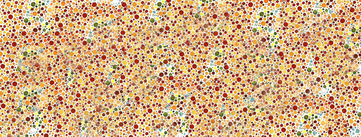
The term "color blindness" is something of a misnomer. Just as most visually impaired people are not completely "blind," most people who have deficient color perception are not completely "color blind." In fact, only a very small percentage of people suffer from a total lack of color sensation (monochromacy). Rather, color-vision deficiency is the inability to perceive differences between certain colors that other people can distinguish.
The cones are the cause
The human retina contains two kinds of light-receptive cells: rod cells (active in low light) and cone cells (active in normal daylight). Normally, there are three kinds of cone cells, each sensitive to a different spectra. One is maximally sensitive to short wavelengths (peak sensitivity is in the blue region of the spectrum), one to medium wavelengths (peak sensitivity is in the yellowish-green region of the spectrum) and the third to long wavelengths (peak sensitivity is in the yellow regions of the spectrum).
The sensitivity of normal color vision actually depends on the overlap between the absorption spectra of the three cones: Different colors are recognized when the different types of cone are stimulated to different extents. A mild color deficiency is present when one or more of the three cones functions poorly. A more severe color deficiency is present when one of the cones does not function at all or is missing entirely.
And mom's the carrier
Although defective color vision may be acquired as a result of injury or disease, the vast majority of color- blindness cases are hereditary – present at birth. The gene for this is carried in the X chromosome. Since males have an XY pairing and females have XX, color blindness can occur much more easily in males and is typically passed to them by their mothers.
Let's get technical: types of color deficiency
Protanomaly (one out of 100 males). The protanomalous viewer sees the color red much more weakly than the normal observer, both in terms of its saturation and its brightness. Red, orange, yellow, yellow-green and green appear somewhat shifted in hue towards green, and all appear paler than they do to the normal observer. The redness component in violet or lavender is so weakened for the protanomalous observer that he may fail to detect it at all.
Deuteranomaly (five out of 100 of males).The deuteranomalous viewer sees the color green much more weakly than the normal observer. Similar to the protanomalous person, he is poor at discriminating small differences in hues in the red, orange, yellow and green region of the spectrum because they appear shifted in hue toward red.
Dicromasy (two out of 100 males). Those who suffer from this type of color deficiency possess only two out of the three color receptor cones. These individuals normally know they have a color vision problem and it can affect their lives on a daily basis. They see no perceptible difference at all between red, orange, yellow and green. All these colors appear to be the same color for this 2 percent of the population.
The cons and a pro
While there are certain situations where color blindness can cause difficulties – for example, in school, trying to discern information on colored graphs, charts and chalkboards; in the closet, trying to match clothing; in the car, trying to determine the best route on a map; or in the kitchen, trying to tell if the meat is raw or well done – it can be advantageous to those serving in the military. Color-blind people can readily spot camouflage clothing, netting and paint that has been designed to confuse those with normal color vision. Because people with a color deficiency learn to compensate by looking for texture, shape and pattern, this aids them in more easily detecting camouflage.
Design tips
If your client is totally color blind, consider going with a completely black and white color scheme. If your client has trouble distinguishing between certain hues, consider a monochromatic color scheme. Go with their favorite color and use different shades of the same color in the room, being sure to incorporate a variety of shapes and textures for visual and tactile contrast.