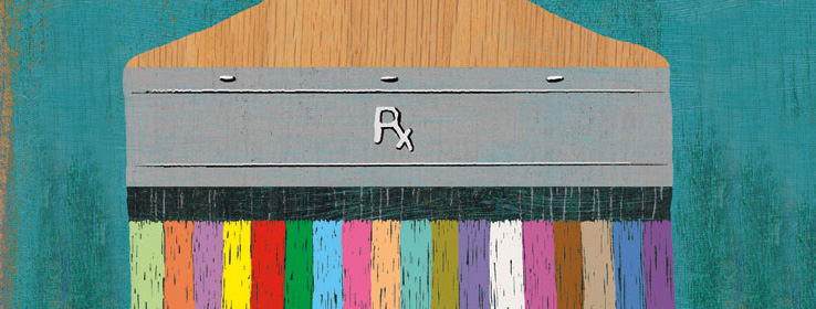
Close


Healthcare interior designers increasingly tap the power of the healing color palette to promote patient well-being.
Decorated in hospital-issue grays and dirty whites, my grandpa's tiny nursing-home room gets its only splashes of color from his green cardigan and a framed photograph perched on his window sill, showing him and Grandma. When I visit, I find the drab environment stifling and can only imagine how dreary it is for Grandpa.
Grandpa doesn't complain. But healthcare interior designers, architects, and a growing number of administrators believe the right medical colors – well beyond shades of gray – can make people's experience with healthcare environments more positive, help facilities compete, and possibly even provide therapeutic benefits to patients, from the newborn to the aged.
With nearly $20 billion spent on the construction of healthcare facilities each year, the stakes for getting it right are high. "We respond favorably to color and light in nature," says Roz Cama, chairwoman of The Center for Health Design. "Retail designers frequently use this concept to lure customers and keep them shopping longer; hospitality designers use color to make guests feel relaxed." But, when it comes to healthcare interior design, "we often fail to use the full spectrum of color and light to enhance the healing process."
Even so, Cama says there are signs of change as healthcare administrators, heeding research that shows patients in thoughtfully designed spaces have higher satisfaction with their experiences and are more likely to select the facility for future healthcare needs, are embracing color. Hospitals are building warm, homey maternity wards to lure "young women who will later make the healthcare decisions for their children, husbands and parents," says Cama. And Grandpa's nursing home notwithstanding, a rapidly aging generation of baby boomers has geriatric facilities following suit.
Color as Patient Cue
Melissa Young, a designer with Sunrise Medical-OneSource in Stevens Point, Wis., proposed dramatic color schemes for the company's Evergreen Retirement Community in Oshkosh, Wis.
It's not always easy to make color choices that will please everyone who will visit a healthcare provider, says the architect on the Evergreen project, Gaius Nelson of Nelson Tremain Partnership in Minneapolis. "People have a lot of variety in their likes and dislikes," he says. Personal tastes as well as cultural, regional and generational preferences can complicate selections.
Cama once designed a psychiatric ward for a hospital that served a Chinese population. Rather than use white, which in China is symbolic of death, she chose muted pastels that wouldn't be so depressing for residents. And while deep, bright colors can distract and delight pediatric patients, they can be jarring for patients with dementia, particularly if they are used on the floor, where sharp color transitions can leave patients feeling they are stepping into an abyss.
Residents of healthcare facilities may respond to colors differently than do staff, who besides being in and out of the facility more, may have a perspective driven less by aesthetics and more by clinical realities, such as ease of maintenance and sterility.
"There were staff members who initially didn't like the color selection" for Evergreen Retirement Community, says Young. "But they don't have to live it 24 hours a day."
In any case, says Cama, interpreting color cues can be tricky. "You can say green is calming, but is it avocado or chartreuse?" And the wrong lighting can foil the most thoughtful color plan. "If you put any color under fluorescent light, it is going to look harsher," says Cama. Color selection, review and approval must be done under the same lighting conditions, she adds.
A Palette to Soothe
Anne Marie Procopio chose serene shades of blue in her design for Franciscan Hospital for Children in Brighton, Mass. Procopio, a designer with Drummey Rosane Anderson Inc. in Newton Centre, Mass., selected cool shades such as Huckleberry (SW 1523) and Sugarplum (SW 1520) in Sherwin-Williams' ProMar 200 formulation to anchor the hospital's Great Barrier Reef theme. The theme and healing colors were chosen to soothe anxious young patients, many with traumatic head injuries that can magnify their response to stimuli such as bright hues. "Blue is a tranquil color," says Procopio. The restful palette and reef theme give children calming things to look at while they are waiting to see the doctor.
"More and more, hospitals are coming to understand the impact of investing in evidence-based [research-supported] design," says Cama. Working with The Center for Health Design, researchers at Johns Hopkins University surveyed nearly 80,000 articles for patient outcomes related to a variety of design features, ranging from room size to type of window to color, searching for design strategies that can reduce stress and length of stay. Though they found little direct research proving the influence of color, other findings, particularly those showing the positive benefits of lighting and patients' views of nature, may have connections to the effect of color on patient outcomes.
There may be no one color prescription for all applications in healthcare design. But one thing seems clear to the people who are creating the places where we heal: Color is critical. Cama can't forget the story of a sick little girl who was having a tough time when she came into the Yale-New Haven Children's Hospital emergency room with her mother. When the child was admitted and transported to a bright and colorful inpatient room that Cama had recently designed, her eyes lit up. "Mommy, can I stay here?" she said. That's proof enough for Cama. That response alone helps her understand the importance of color in healthcare design, she says.


