Close

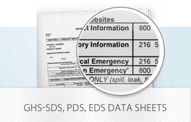
Expert advice, ideas, solutions and important industry information that can help you stay on top of new products, applications, industry guidelines and government regulations.


Discover More
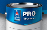
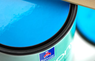
Pro Industrial™ Acrylic Coating
Learn about this product
Store Locator
Find Your Sherwin-Williams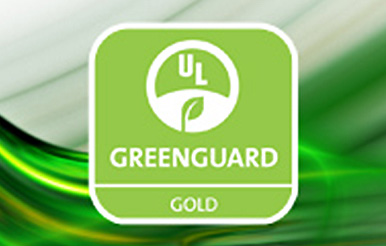
GREENGUARD Gold Certified Products


