Close


Want to stimulate a lagging conversation? Introduce the topic of education in America today. You'll get all sorts of opinions about how much is spent on education, what subjects are taught, how students are performing and the need for new schools. What likely won't be mentioned are color schemes for schools.
While the color palette selected for any given school may not seem as important as those other topics of discussion, the choice of color used in schools can either enhance or impair learning, morale and behaviors. Throughout the years, color trends for schools have come, gone and changed. All the while, studies have shown that color affects a student's attention span and perception of time and can reduce absenteeism and vandalism. What is a school to do? Is repainting every couple years required — or helpful? Yes. Are there some colors that withstand the test of time? Yes, again.
Some color — any color — is better than no color in a classroom. Indeed, the psychophysiological effects of color have entered common knowledge: generally, red and orange are stimulating, yellow is cheery, and blues and greens are calming. Warm and cool colors make people perceive temperature differently, either warmer or cooler as their name implies. In addition, cool dark colors seem to recede, whereas bright warm colors seem closer — something not lost on designers who need to use illusion to improve a space.
Also, the saturation of a color plays an important role. A highly saturated red, for example, is more stimulating than a brick red, regardless of hue.
Of course, one shouldn't select a color scheme for an educational facility — or any other facility — without considering other aspects of the environment. And, often, the choice to include a variety of hues representing different degrees of lightness, saturation and perceived temperature is very effective within the total environment.
What colors for what age group?
Young children seem to gravitate towards bright colors — primarily warm colors, such as red and yellow. One study showed that children between the ages of five and eight rejected black, white, gray and dark brown. Instead, the youngsters preferred red, orange, yellow and violet. Warm and bright color schemes seem to complement the active, energizing nature of children. However, while color brightness and intensity are useful in attracting attention, they may not be conducive to learning.
For pre-schools and elementary facilities, mild, soothing colors — such as warm, soft shades of white and light creams — work well as the anchor color. Stronger, brighter colors are recommended as accents and focal points. In this age category, it should be remembered that children's artwork is frequently on display, so the color scheme selected shouldn't compete with the artwork, but, rather, should compliment or enhance the display.
Teenagers, on the other hand, view primary colors as immature. These children are often influenced by prevailing fashion. Young teens typically reject neutral colors in favor of blue, ultramarine and — their current favorite — orange. In selecting a color scheme for middle schools and high schools there may be more leeway, depending on the objective. Subtle colors work well, such as light sage greens and refreshing blues and greens, with brighter, trendy and more saturated hues used as accent colors. In addition, the use of school colors also works to promote school spirit.
The situation changes in technical or trade school environments because the learning activities are different from those in a traditional classroom. Where computers are used a lot, eyestrain and glare are common problems. Mild and mid-toned wall and floor colors help reduce the contrast between workstations and surroundings. In an automotive trade classroom or workspace, try using metallic faux finishes to replicate colors found in automotive finishes or race-car colors for accents that enhance the learning environment.
College-level facilities must appeal to a broader range of ages — from late teens to adults of all ages. Variety of color is important in this category. Dark, highly saturated colors can be used strategically in a classroom to avoid distraction from equipment like televisions, video monitors and projectors. Another option, as in the case of middle and high schools, is the use of school colors to promote school spirit.
Other factors affect color preferences, not just age — personal preferences and personality, for example. Some children like red. Others don't. Sometimes personal preferences are influenced by colors a child is exposed to in early childhood, such as the color of a child's bedroom or his "favorite" outfit. Extroverts may feel more comfortable with stimulating colors, while introverts may be more "at home" with the sedate qualities of greens and blues. While each student's preferences cannot be addressed, a balanced color environment will produce positive response.
Culture plays a role, too, as does region of the country. Here are several examples: In the Sunbelt, where the sun shines most days, orange may be too over-stimulating a color choice. In the northern part of the United States where winters tend to be gray, taupe or gray in quantity is not a good choice. On the West Coast, where day-to-day life is less conservative, bright accent colors, such as oranges, bright blues and lime greens, are popular choices. On more conservative East Coast, traditional and muted toned-down colors, such as hunter green and burgundy or pastels, are preferred. In the Southwest, more saturated colors are favored, possibly because of the area's stark landscape.
What color for what room?
Where you specify bright, attention-getting colors and mild, calming colors depends a lot on the function of the space.
In classrooms, students and teachers need to feel stimulated and motivated, but not so much so that the colors discourage concentration. An effective technique is to paint the teaching wall a deeper or brighter shade than is used on the side walls. This does two things: It attracts attention to the front of the classroom, yet the eyes get a visual break when focus is shifted to the side walls.
Libraries don't need to be dreary, dull spaces. Actually, using color to warm and brighten these spaces encourages students to read. Walls and stacks lined with books can be energized with the use of colorful wall graphics. Frequently, libraries also contain computers, so remember to select colors that help reduce glare and eyestrain.
Auditoriums, gymnasiums and cafeterias are often poorly lit. In addition, their large size makes color selection a critical issue — bright colors on large expanses can easily overwhelm the space. Lighter warm tones or neutrals are recommended for the main color, with brightly colored accents to invigorate the room.
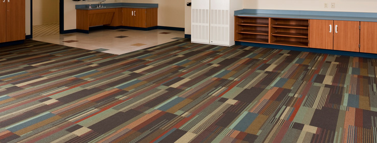
Corridors and stairwells are ideal spaces for bright, happy colors to reflect school spirit. Lockers can be painted school colors. Mascots and other colorful wall graphics add interest. Strategic use of appropriate colors can help visually shorten long hallways and enlarge small, dark ones. In corridors and stairwells combinations of colors also can be used effectively to color code sections of the building — depending on use, for example — and can aid navigation and traffic flow in a large or multi-story building.
Changing colors is fast and inexpensive
Funding for education, typically, is part of the equation. Fortunately, changing paint colors is probably the fastest and least expensive way to improve an educational facility's environment.
As color trends come and go, it's not as easy to replace furnishings as it is to repaint. In new schools, apply trendy accent colors on a single wall — while the others are painted in a classic neutral color. Only one wall will need a new color designation down the road.
In older schools, new paint is a useful tool for renovation, plus it can be accomplished during holiday and summer breaks, or, if low VOC, low-odor paints are used, even while school is in session.
Purchasing paint in quantity, obviously, is a cost-saving tactic, and it can be inventoried for touch up and repaint purposes. However, selecting a variety of accent colors based on age preferences should reap valuable benefits, at minimal additional cost.
School boards and administrators should look at color selection with fresh eyes. Conventional standards aren't necessarily the best choices. Get students involved and you'll add creativity and imagination to the process. Remember that color, as well as decorative patterns and textures, also can be added to the environment through furnishings, window treatments and floor coverings.
Consider paint's light reflective value when making a selection. Sometimes light reflection from a painted surface serves as a secondary light source. Mid to light colors with a light reflectance value or LRV (this number can often be found on paint manufacturers' samples or swatch cards) at least 50 are appropriate for classrooms, but even the lightest paint can't help a poorly lit classroom. In these cases a professional lighting specialist should be consulted. The sheen of the paint selected makes a difference, too. High sheen makes colors appear richer and more saturated.
Not only does color affect learning, motivation and performance, a series of studies conducted by the Department of Education in Connecticut (1961) showed that school pride increased and behavior problems — including vandalism — decreased in schools that made color changes.
Color is an important decision in business, medical and retail facilities. Its use in educational facilities — where even small changes can produce A+ results — is worth serious consideration as well.
Popular color combinations from the not-so-distant past
How well do you remember those trendy color combinations of recent history? Serena Fenton compiled the following list of the most popular color combinations for libraries and school media centers in her article, "Architectural Follies," published in 1999.
1960s: Avocado green and harvest gold
Early 1970s: Bright primary colors: red, yellow, blue
Mid-1970s: Electric blue and Kool-aid orange
Early 1980s: Gray with mauve and jade accents
Late 1980s: Miami Vice pastels
Early 1990s: Dark earth tones: gold, green, burgundy
Late 1990s: Pale citrus tones: tangerine, lemon, lime
(Source: Fenton, S. (1999). Architectural Follies. School Library Journal, Vol. 45 Issue 2, p26.)