Close

A look at how museum exhibition designers maximize color.
Picking colors for a client's home or business can be challenging. You've taken all the appropriate steps to determine the client's needs, the function of each space, the architectural elements, the lighting conditions and all other essential criteria. That just leaves selecting the perfect wall colors. Stumped for creative solutions? Try checking out your local museum for inspiration. Faced with massive walls and priceless works of art, exhibition designers utilize color to synchronize space and art, creating a complete experience for visitors.
Visualizing the story
Just like any other client, the curator has a concept that must be translated into a visual reality. The evolution of a show is a shared process involving the curator, designer and, if available, the artists themselves. Beginning with a checklist of artwork and a layout of the show, the team analyzes the permanent features around which they must work. Most importantly, the "story" behind a show has to be clearly defined: Is it an overview of unfolding historical events? A retrospective of an artist's work? The underlying theme helps drive the palette that is ultimately developed. Additional criteria that often play a role include the size and scope of the show and the relationship and groupings of the objects. With the spatial criteria and mood defined, color becomes the component that ties it all together."
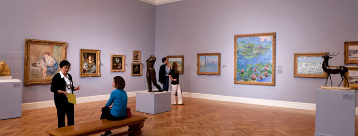
Why not just white?
"Despite popular perception, white is not a one-size-fits-all solution. Jennifer Sonderby, head of Graphic Design at the San Francisco Museum of Modern Art (SFMOMA), explains. The "white cube" aesthetic was developed by Alfred Barr of the New York Museum of Modern Art in the 1930s to present artwork as timeless, eliminating the use of saturated walls, which was popular earlier in the century. Adopted as the norm in exhibition design, this trend works for some situations, but it's not appropriate for every case. In fact, studies have shown that the harsh contrast presented by white walls can cause eye fatigue. Using a color specialist to analyze their space, the SFMOMA developed a custom mix with a slightly warmer cast to use as their basic white."
Nuances are noticeable
Color has the ability to emphasize aspects of art in a way that white cannot. One curator at the SFMOMA prefers using warm gray walls when presenting black and white photographs because the muted color provides less contrast to the art, minimizes distractions and creates a more intimate viewing experience. Similarly, the Baldessari exhibit at the San Francisco Legion of Honor utilized shades of gray, because the designers determined that other colors clashed instead of helping the artist's colors pop.
Subtle shifts in color or undertone can make a huge difference in enhancing the appearance of artwork. While working on a porcelain gallery show, Bill White, exhibition designer at the Fine Arts Museums of San Francisco, discovered that by swapping the existing yellow fabric for mauve, new subtleties emerged from the pieces. Oranges, blues, greens and delicate pink colors now stood out, whereas before, they had not been as noticeable.
Values matter
A designer must also consider the value and saturation of wall colors in relationship to the pieces, since a viewer's perception can be radically influenced by these variations. White often prefers to use de-saturated hues - taking a color from a fabric or painting and graying it down. In this manner, he feels the color doesn't dominate a room or fight with a painting; the eye is aware of it, but not distracted by it. When designing "Artistic Luxury: Fabergé, Tiffany, Lalique" at the Legion of Honor in San Francisco, White selected a deep, muted, historically accurate palette that skillfully defined the separate galleries devoted to each artist, while uniting their work with colors that truly reflected the elegance of the Gilded Age.
Linking spaces
By using a range of colors with a consistent lightness, intensity or hue, rooms within an exhibit can be distinctive, yet flow smoothly from space to space. In an exhibit for Joseph Cornell at the SFMOMA, walls were painted in a monochromatic range of blues. The show opened in the first room with his signature "Cornell Blue," became progressively darker toward the center, then became progressively lighter as the viewer moved to the end, and ended with a paler version of the first room. The changes in value also helped identify shifting themes. Jennifer Sonderby recalls that the combination of low lighting paired with dark-hued walls created quite a statement.
The black and white photography exhibit "Lee Friedlander" at the SFMOMA received a completely different yet equally dramatic treatment. Working with nearly 400 pieces, the designers interspersed vibrant walls in yellow, pink and chartreuse throughout the exhibit to help break up the density of the work and to guide viewers through the galleries.
Experience is everything
Color can also transform a space's proportions and size, whether it's spacious or intimate. Oversized pieces need much more real estate than smaller works, so the gallery space must be manipulated to achieve the correct balance between walls and art. One technique used by designers is to paint a band of color across the top portion of gallery walls, creating the perception of a lower ceiling and a more personal atmosphere.
Translating inspiration
Color can be used to develop a mood, create a cohesive space and provide clear transitions. During your next museum visit, examine how the designers showcase the artwork through their skillful use of color. Take inspiration from the symbiotic relationship developed between the art and the walls and use it to add a distinctive new dimension to your next project.


