Close


Learn how Tina was inspired by an online photo
I'm definitely one of those people who can easily get into project overload mode. So when it was time to freshen up the home with a more modern color scheme on the walls, I promised myself to take one room at a time.
As far as choosing the paint colors for the family room I got off to a great start thanks to a little online exploration. Actually it was a photograph of an elegant throw blanket I had stumbled upon on the Internet. It had the perfect colors running through it and, in fact, the background room colors in the photo were in line with my tastes as well.
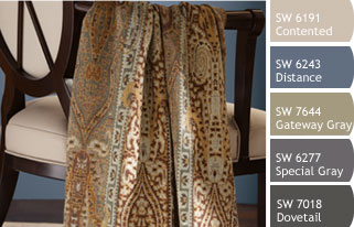
Photo:
Use Snap It!TM by Sherwin-Williams to find a perfect palette.
Use Snap It!TM by Sherwin-Williams to find a perfect palette.
Internet Inspiration
Now here's where digital technology in the home really came in handy. I copied and pasted the blanket photo into an online color tool called Snap It!™ that analyzes the image and tells you the color palette based on Sherwin-Williams paint colors. You can find it at SnapYourColors.com and download it to your computer in a flash...no charge! The tool basically breaks down all the colors present in the photo so you have the entire color palette to refer to. So not only was I able to match the blanket color to a paint color called Gateway Gray, I was able to make a decision on my coordinating family room trim colors right then and there.

Photo:
Easily install Chip It!TM by Sherwin-Williams in your browser and start matching your inspiration to our colors.
Easily install Chip It!TM by Sherwin-Williams in your browser and start matching your inspiration to our colors.
Colors that flow through the home
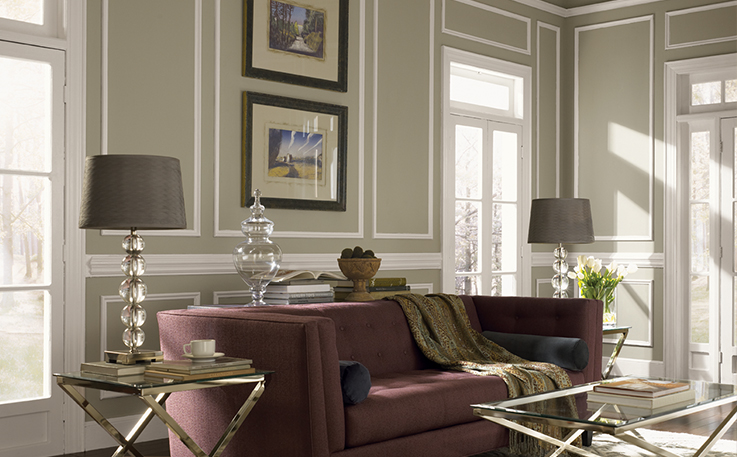
A few days later, when I got to the Sherwin-Williams store—with paint color selections already in hand—I was in for a pleasant surprise. I learned that my color selections were part of a larger coordinated palette of paint colors that would allow me to create a harmonious flow of color throughout my home. The collection is called Liveable Luxe and has 20 colors that work well together in any combination as you move from room to room. Suddenly, my fear of project overload was overridden with relief. In one fell swoop I had colors for the kitchen, the hall and all four bedrooms! One of the colors called Silvermist was a pale antique green which was spot on for the hallway bathroom. And a striking deep color called Special Gray gave my dining room a sophisticated look and feel that exceeded my expectations. The color throughout the house is phenomenal—elegant, yet approachable. It's everything I had hoped for!
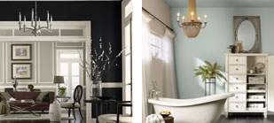
Photo Left:
Create harmonious color flow from room to room. Special Gray SW 6277
Photo Right:
Give your bath a sophisticated yet relaxing feel. Silvermist SW 7621
Create harmonious color flow from room to room. Special Gray SW 6277
Photo Right:
Give your bath a sophisticated yet relaxing feel. Silvermist SW 7621
Browse Project Inspiration ← Previous