Close


Don’t let its elegant palette fool you: The kitchen in this newly constructed Williamsburg, Virginia, Colonial is designed for living.
By Kitty Shea
It’s a form of translation fit for a diplomat: listening to what clients say they want and then revealing to them what they actually want. As any experienced residential designer knows, “I want a white kitchen” can mean many different things. “Ninety-five percent of my clients come to me with a picture off HGTV.com or Pinterest, and it’s your typical white kitchen: white marble countertops and white subway tile backsplashes,” says designer Kathryn Salyer of Williamsburg, Virginia.
Salyer’s command of kitchen design, and her subsequent care and handling of the familiar white request, helps her recognize that, as she says, “What clients are really falling in love with is the bright, clean look.”
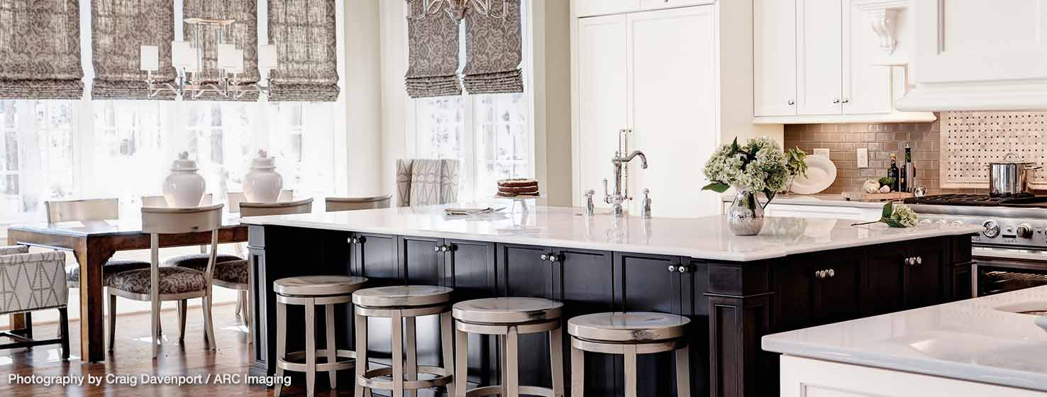
Take, for example, this kitchen, which won Salyer second place in the Thermador Kitchen Design Challenge, and a happy client. The client and her husband initially contacted Salyer for one-off feedback on their custom home’s untraditional layout: no formal living or dining rooms. The home, built by Cartwright Construction, is a brick, center-foyer Colonial located in a Williamsburg gated community.
Parents to a 5- and a 7-year-old, he’s a business owner, she’s a vice president of sales and they both frequently travel for work, spurring their desire for open, usable space that supports time at home as a family.
To Salyer, “open floor plan” meant few walls for cabinets. The solution: her signature large island with storage aplenty and space for daily dining. She designed using zones, keeping the refrigerator close enough, yet out of the cooking zone, anchoring it on the end nearest the living space.
Salyer is a firm believer in living real. “We live in houses. I don’t care how big your house is or how much money you have, it’s figuring out how we live and want to live,” she says.
That belief in durability extended into Salyer’s coatings choices. She had the walls painted with ProMar 200® Zero VOC Interior Latex Paint in flat finish and the trim in ProClassic® Interior Waterbased Acrylic-Alkyd in semi-gloss. “I really like the zero VOC option [in ProMar 200] when I'm working in a home that has children, and ProClassic has a nice smooth texture for trim,” Salyer says.
Salyer’s concept of “family time” conjures memories of science-project volcanoes in the middle of the kitchen and, subsequently, the need for durable materials that don’t easily mar. “One of the things I bring to the table — I hate to say this — is that I’m a little older and have raised my kids,” says Salyer.
Salyer’s experience and wisdom were also valuable assets when it came to picking out the project’s color palette. Salyer didn’t believe her clients should have to repaint or reinvest in furniture until their kids were graduating high school. So, rather than going with a too-trendy palette, Salyer eased the interior scheme toward more studied nuance.
Salyer guided the client to walls in Balanced Beige (SW 7037) and cabinets and trim in Alabaster (SW 7008), the Sherwin-Williams 2016 color of the year. It’s one of Salyer’s go-to colors. “Alabaster isn’t stark white. It’s not cold white. It has a touch of warmth but doesn’t commit to beige or off-white, so it’s not muddy or dirty or dingy; it’s still very clean,” she says.
If it’s on the kitchen cabinets, Salyer insists on applying it throughout the house, so Alabaster is carried across all of the home’s crown molding, wainscoting, columns, window trim and casings. “I don’t like to mix those colors,” she says. “I hate for a piece of crown molding to move into the side of a cabinet and be different.”
“Grays are very popular right now,” Salyer says, “but they read cool.” By using fresh fabrics that are pertinent today but can be easily updated, “we kept the kitchen on-trend. We went with a palette that’s cool but not too gray, warm but not golden. Golden tends to be a little old-ladyish, and gold has been done and done and done. This is a very Colonial area, remember.”
When restlessness sets in, Salyer’s foundational palette will easily embrace navy, turquoise or even orange rugs, throw pillows and other “bits and pieces of trendy,” the designer says.
The homeowner says it’s just what she wanted: white but with depth, dimension and hominess. And so held Salyer’s wisdom: “What clients are really falling in love with is the bright, clean look.” It’s as if Salyer knew how to translate exactly what her client was asking for all along.
Sherwin-Williams STIR® Magazine editor Kitty Shea is a longtime shelter industry writer.