Close

With the work space increasingly defined by movable partitions and panels, the careful selection of the colors of these and other office elements, such as wall and floorcoverings, can contribute significantly to an aesthetically pleasing and more productive workplace.
Today's office is a whirlwind of change. Continuing advances in workplace technology and the global economy are encouraging people all over the world to develop and learn new and dramatically different ways of working. Where success was once most often equated with tradition and stability, in today's dot.com-influenced economy, innovation and fast-track flexibility are perhaps even more highly valued.
As a result, the shape of the workplace is also changing. Gone are the days when static structures and staid architectural woodwork defined territory. Today, systems furniture is increasingly being used to meet higher churn rates and to cost-effectively create the necessary balance between privacy and collaboration in ever-changing office environments. Changes in tax laws also have made the use of temporary structures to create walled environments financially advantageous, since movable architecture can be depreciated more quickly than fixed assets.
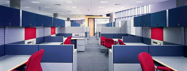
Most temporary walls are demountable partitions or floor-to-ceiling wall panels comprising a combination of frames and skins. These physical structures provide sight and sound barriers that direct traffic flow and demarcate workspace. When carefully selected, the colors of these physical barriers, and the colors used for other office space elements such as wall and floorcoverings, can contribute significantly to the creation of an aesthetically pleasing and more productive workplace.
Study after study has shown that color influences not just mood, but also wellness and productivity. The impact of a well-designed environment on emotional well-being is becoming widely known and widely accepted. Most experts in color and design agree that we are living in a time in which individuals are sophisticated and assertive about their color preferences.
Heightened sophistication about and sensitivity to color may be because of the pervasive influence of consumer magazines and television, where room settings are pleasingly designed, and because affluent societies can shift their focus from survival to quality-of-life issues. Whatever the reason, it is now understood that beauty in surroundings, including workplace surroundings, can ease the stress of confinement and increase the comfort and satisfaction of those present in the space.
The Contributions of Color
Office spaces support several kinds of very human needs. These include functional needs such as the ability to concentrate or to collaborate, and ergonomic needs such as the ability to work comfortably with minimal fatigue. But office spaces also speak to emotional needs ranging from the need for personal space to feelings of self-worth. All of these needs — functional, ergonomic and emotional — must be considered when color is used to lend shape to office environments.
Functional needs. Compared with workers in the past, today's workers are required to perform more complex tasks at a faster pace. To the degree that this expectation increases the need for concentration, it also increases the need for privacy. Privacy is primarily associated with the retreat from people to allow for confidentiality of information, concentration on information, and regulation of interaction. While needs for privacy are increasing, so are needs for collaboration. Multi-disciplinary work teams and other collaborative processes implemented in the last decade to stimulate creativity and improve quality require significant personal interaction.
The physical setting is one way to encourage privacy or collaboration. The positioning of a chair, for example, can contribute to the creation of a welcoming space, or it can convey intrusiveness to the visitor. Color can be used in a similar manner. For example, "punch colors" — bright and saturated or rich, sophisticated tones — when placed in strategic locations, can be effective in creating visual interest, for defining space and for identifying departments. "Bridge colors" — usually moderate tones or neutrals — can be used to unify an office environment.
Ergonomic needs. Ergonomics is concerned with the reduction of physical stress (or distress) in work environments. Color carries important associations in the human brain that are related to the full range of human emotions that may either increase or decrease perceptions of stress. For example, today's workers toil for more hours than any workforce since World War II. Long periods spent working on computers requiring close-up viewing of busy, bright-colored screens can cause workers to yearn for softer, lighter, more restful colors that simplify and humanize their surroundings.
For this reason, it is important to avoid in workspace the use of busy patterns that create illusion rather than define space. Instead, keep lines simple and clean, and use contrasting tones such as deeper, anchoring colors on floors and midtones on tables with a darker edge to distinguish work surfaces, doorways, railings and other architectural features and furnishings.
Emotional needs. Attitude and psychological well being can have a major impact on productivity and job satisfaction. Color also can contribute to a sense of well being by contributing aesthetically to workspace. Unlike their parents' generation, the Baby Boomers who comprise the lion's share of today's workforce, are not supporting a war effort or just 'making ends meet.' They are seeking to improve their living standard. As a result, coupled with a very real need for stress-relief, this group also has an eye for luxury. As a result, Baby Boomers are finding themselves drawn to soothing colors that cool and refresh the spirit.
On the other hand, Generation Xers have a high degree of comfort with technology and modernism along with an admiration for quirkiness and a desire to infuse personality into a space. They also are more environmentally conscious than their Baby Boomer predecessors. Though old enough to remember the fall of the Berlin Wall, Generation Xers have primarily lived in a global economy and show strong acceptance of the global color palette.
Many office workers in the U.S. decorate their workspace with personal belongings. People say they personalize their workspace because it improves their morale and increases their comfort level to have familiar items in their environment. Some individuals want to offer their co-workers a glimpse of their individuality and their life outside the office. What they may actually be doing, however, is staking out personal space or territory. Since demarcating space generally contributes positively to the work environments, tackboards and markerboards may be included in office environments for the purpose of encouraging people to post photos, humorous cartoons or other items of personal interest.
Putting Color to Work
While a variety of materials ranging from wallcoverings to floorcoverings may be used to infuse an office space with color, the most versatile and cost-effective medium for many color changes is paint. One recent advance in the coatings industry has been the development of extremely low-odor latex interior coatings that allow paint to be applied in occupied spaces without the problem of paint smells disturbing workers. The new low-odor paints are ideal for application in today's fast-paced work environment, where tear-down and build-out often must occur in a matter of a few days. These paints may be appropriate for offices, lobbies, hallways and other work areas.
Certain guidelines provide a baseline for making sound, simple judgments about colors appropriate for walls, floors, and work surfaces. Successful color specifications rely on creating a balance among these four factors:
Hue, or color family
Degree of lightness, darkness and grayness
Saturation, or level of brightness and intensity
LRV — degree of light reflected
Defining space with color is a design strategy used to draw attention to specific areas or to highlight physical details. Color also can be used to emphasize positive design elements and minimize unattractive ones. For years, large medical facilities have depended on color as a coding mechanism for jogging memory and enabling visitors and staff to navigate through complex floor plans by following color-coded markers or signs. These same techniques may be used, to a lesser degree, to visually designate departments, direct traffic flow and delineate space in office environments.
For example, contrasting tones can be used to help distinguish desk and other work surfaces, doorways, railings and other architectural features and furnishings. Contrasting tones also play an important role in flooring configurations that provide direction and identify rooms by function. Carpeting in a single color featuring a section of a contrasting color can be used to indicate entryways to departments of key offices. Using contrasting colors for upper and lower walls along long corridors can make these areas more inviting and less monotonous.
Decisions about color also should take into account existing equipment, particularly since, in today's office, computer housings and other business machines may be dominant features. Where older, bulky, less attractive business equipment is present, bridge colors may be selected to blend with equipment housings so they become less noticeable. This is less necessary where office equipment is more sleek, streamlined and sophisticated. The newest generation of equipment also may require special consideration, since some of these housings incorporate bright, translucent colors. Crisp, clear colors work best with these accents and reinforce the trendy, high-tech, high-energy message conveyed through these purchases.


