Close


2017 Color of the Year
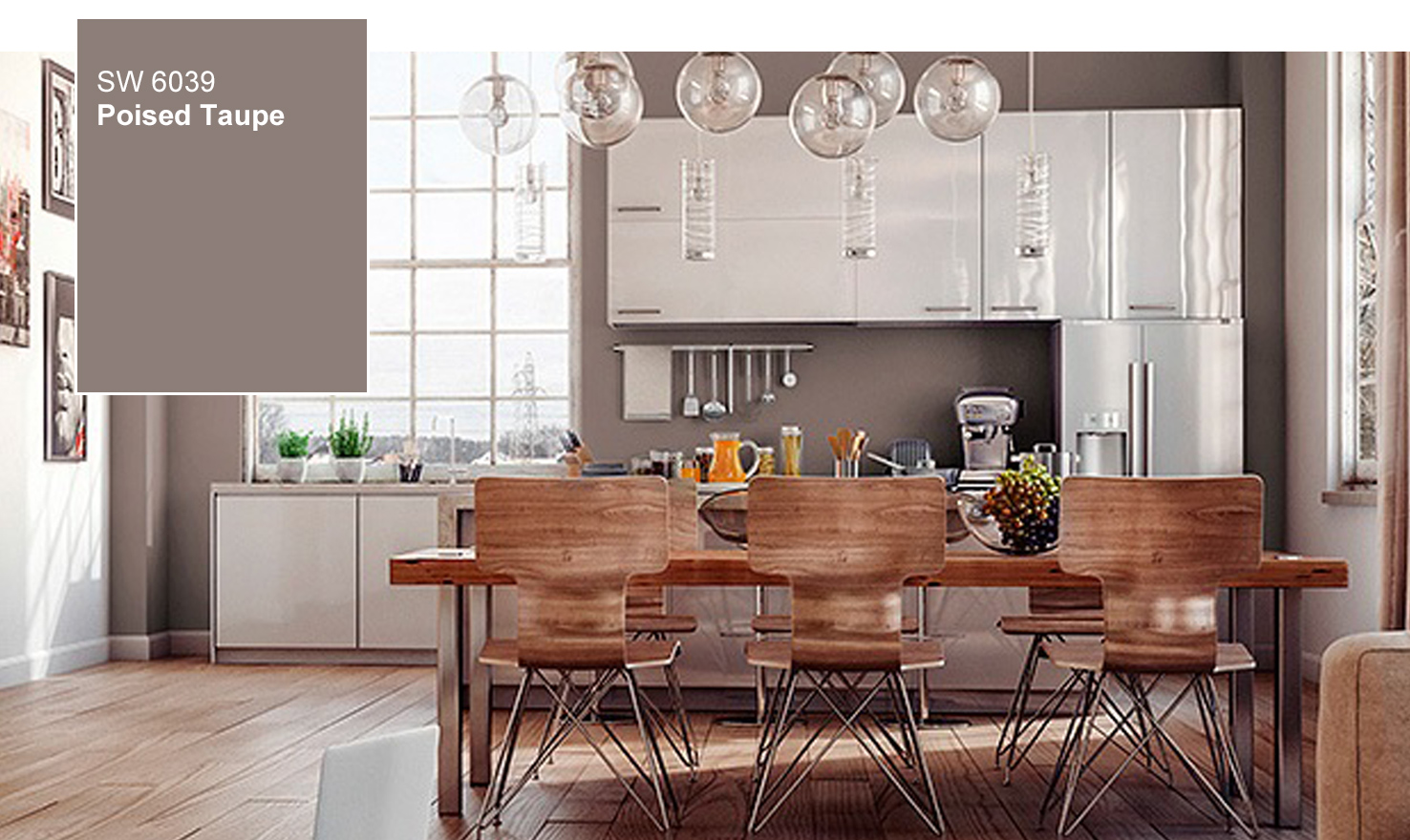
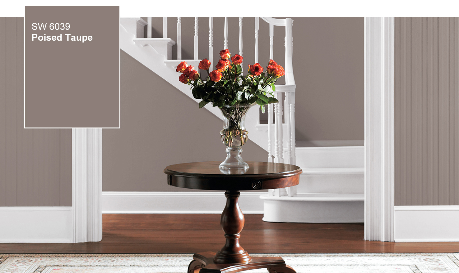
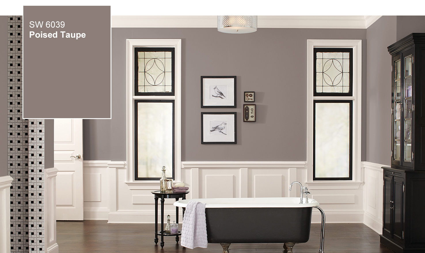
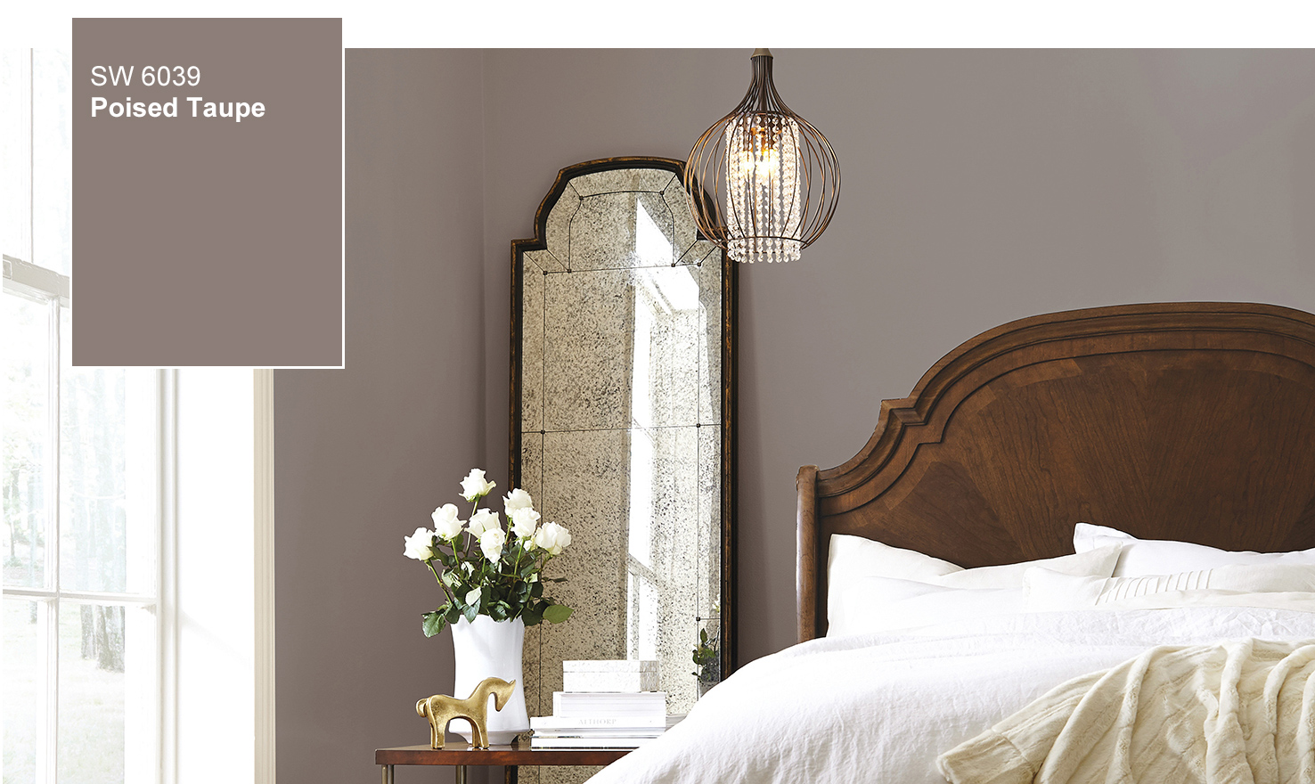
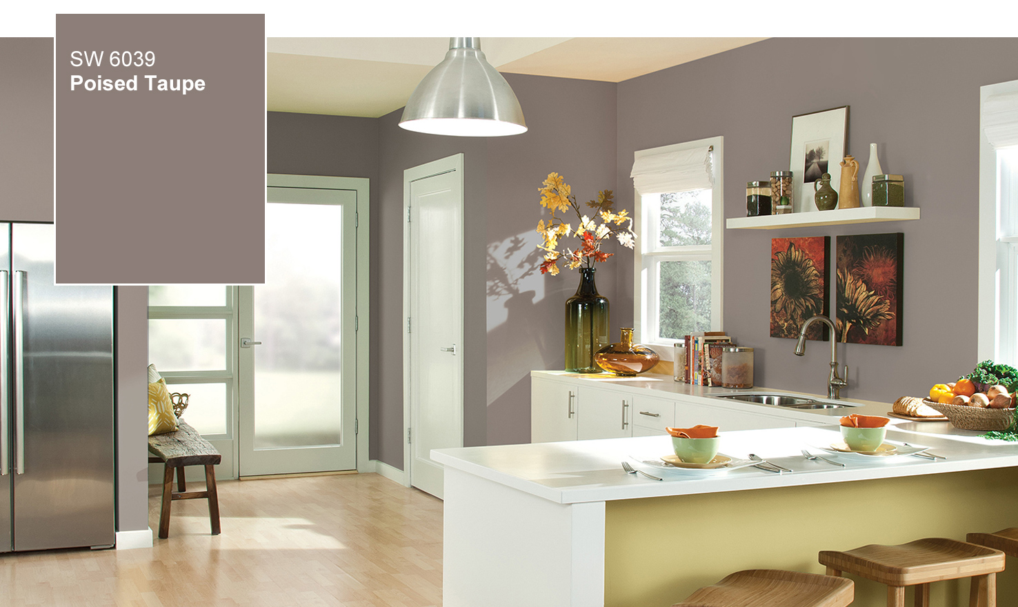
Sherwin-Williams doesn’t usually like to play color favorites, but in this case we can’t resist. The color we anticipate defining 2017 is Poised Taupe SW 6039 creates a cozy lifestyle and brings a sense of sanctuary into our homes. It diffuses the stresses of the world outside our doors — so much so that we feel restored and in balance when we walk across our threshold.
The Danes have a word to describe this feeling, hygge (pronounced hue-gah), which loosely translates as cozy, or creating a sense of coziness and warmth. The soft glow of candle-light, a toasty drink, and the company of family and friends is certainly hygge, but this feeling comes from creating the right atmosphere.
There is a particular beauty to be admired in homes that are allowed to age gracefully and show the wear and tear of everyday life. Lived-in homes seem to evolve harmoniously with their inhabitants. Every scratch, crack and mark records a story, a memory. The patina of a weathered wood tabletop can reveal the life and laughter of a party or the stain of spilled milk. At a time when perfection can seem like the ideal, a space that celebrates a well-lived life can be a sanctuary.
Our story of taupe is simple. Earthen brown combines with conservative grey and the result is a weathered, woodsy and complex neutral that celebrates the imperfections and authenticity of a well-lived life.
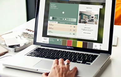
Using the Sherwin-Williams ColorSnap® Visualizer, you can explore the Color of the Year and with the swipe of a finger see it on any wall.
Tag your Poised Taupe Twitter and Instagram posts with #SWCOLORLOVE or upload a photo.
2017 Key color combinations featuring Poised Taupe…
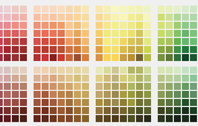
In addition to the “warming up” of neutrals in general, 2017 will see several key colors emerge in combination with taupe.
Cornflower Hues
Faded indigo and lighter cornflower hues, pair with modern white and Poised Taupe for a charming palette, reminiscent of the French countryside.
Organic Re-imagined
Vegetal green, citrus green, weathered bronze and mustard yellow pair with Poised Taupe to create a contemporary organic palette – re-imagined for the modern world.
Vintage Pastels
Pastels take on a vintage vibe with dusty ink, amber, Poised Taupe, sage and oxidized yellow.
Wine & Taupe
Deep wine, purple and Poised Taupe bring warmth to the dark tones favored in 2017. Silvery grey and intense teal provide balance and drama to this rich, mysterious palette.
Eroded
Red and coral are vibrant and ore rich when combined with Poised Taupe and dusky rose. There is a natural feel to this palette, reminiscent of silt, clay and red stained bedrock.
Yellow POP
Yellow takes bold direction when paired with black, white, Poised Taupe and deep teal for a super graphic look.