Close

STIR talks to professional decorative painter and gilder Bernie Forese about her work, her inspiration and how color plays a key role in her projects.
If the words "faux painting" conjure up mental images of sponge-dotted walls or amateurish Tuscan plaster, it's time to positively refresh your mindset and meet Bernadette Forese.
Start of the finish
Forese is a prolific Pennsylvania-based artist whose exquisitely rendered faux finishes grace the interiors of churches, banks, museums, commercial spaces and private homes. And although she began her business, thefauxpro.net, 10 years ago, her desire to express her creativity was ignited far earlier, during childhood.
"I got started very early by apprenticing with my dad, who restored furniture and gold leafing in a small workshop in our home," says Forese. "He and my grandfather ran a butcher shop by day, but my dad's real passion was furniture restoration. I loved everything about his workshop ? the smells, the feel of the wood, the tools; just everything!"
But while Forese was enthralled with hands-on pursuits, her parents insisted she get a college education. So the artist earned a B.S. in business management and became a successful systems engineer. How did she eventually make the shift from corporate worker to decorative painter?
"When I had my children, I stayed home to raise them, and when my youngest was going to school full days, I decided that I wanted to go back to work. But this time, I was going to do what I wanted to do. I went to school to learn how to do decorative painting as a professional."
Light, color, inspiration
Forese is now an accomplished decorative painter and gilder ? in fact, her newest company, philadelphiagilding.com, focuses on applying and restoring gold and other metals to three-dimensional surfaces. Whether it's transforming a cabinet from old to old world, making new columns appear antique, or designing contemporary custom "wallpaper" with paint, Forese delights in the diversity of her work and the challenges each venture provides.
Light and shadow are key considerations in planning her projects. "If a client wants me to do a metallic or shimmering finish but there's no light in the room, the finish will not look as spectacular as it could. Similarly, if the room is only going to be used in the evening hours, then it's important for me to show sample suggestions in that particular light."
Whether it's painting a glossy marbleized fireplace fa+ºade in a living room, a trompe l'oeil corporate logo on the floor of a quarry company's visitor center, or a complexly shaded ceiling of The Hershey Story Museum, color plays an important role in Forese's projects. And since her clients range from homeowners to architects, from designers to business owners, Forese has many tastes to please.
"Very often, interior designers that use me as their decorative painter know exactly what color(s) they want me to use, and that's great. However, there are many customers that don't know what they want and really have a hard time narrowing it down." Forese works in numerous styles, from classical to traditional to European, and so finds visual touchstones especially effective in helping clients select colors. To inspire decisions, Forese sometimes shares magazine or book photos to show how certain tones or accents bring depth and style to a finished space. "Other times," says Forese, "I'll use my iPad, and, using a previous photo of the client's wall, will click to change the color on the wall or ceiling. That's a really effective tool."
As for where she finds her own color inspiration, "I love to look at flowers and see the color scale and proportions and combinations that nature freely provides. For my design inspiration I turn to current magazines like STIR (of course!), Veranda and Architectural Digest." An avid researcher of new as well as period designs and techniques, Forese adds, "It's important that I do my homework before stepping foot inside a client's home or business."
The gild
At this point in her career, Forese has painted all over the East Coast, lending her talents to nearly every type of d+¬cor or structural surface. Asked if she has a favorite among a decade's worth of decorative painting, Forese says, GÀ¡£You know, to be honest, I love the variety my job provides, so I'm thrilled to go from project to project, with each surface being a unique and different challenge.GÀ¡¥
That said, Forese's talent with gilding is particularly noteworthy, and not only because the ancient art is experiencing a renewed popularity in hotels, churches, homes and other interiors. GÀ¡£I love to gild, and I love using gold leaf,GÀ¡¥ says Forese. GÀ¡£Gilding is a very old, traditional technique. When doing gilding in churches, I almost always use pure 23karat gold. It's a careful process, and when you're using the gold, you feel connected to the past as an artist.GÀ¡¥
The connection is not only emotional; it's tangible, too. As Forese describes the experience of gilding the decorative aspects of older churches, she shares a tantalizing secret: GÀ¡£Each time an artist contributes to the design, they leave their mark. It's their own hidden signature in the church ? their name, town and the date ? and the only person who'll see it is the next tradesperson hired to do a project.GÀ¡¥
Inside the toolbox
Forese shares her impression of Sherwin-Williams products and resources:
You can't beat the help. "I do a lot of custom creation of colors to match specific surface colors, especially marble. When I create these colors, I bring a small paint sample to my local Sherwin-Williams store and they talk with me about my substrate and whether it's commercial or residential, and so forth, and then recommend a few products that will "do the job" for me. Plus they match the color perfectly every time.
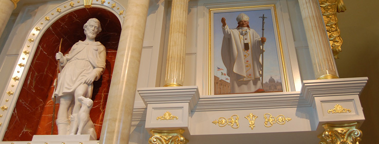
A great example of this: the Retablo at St. Rocco's Church in Avondale, Pa. For this project, I used Sherwin-Williams Duration Home® in semi-gloss finish for the marble and the wall. For all three hues ? the cream, the red and the blue ? I had to create custom colors to match the existing marble and paint. So I mixed my own paint in my studio ? a little squirt of this tint, a little squirt of that tint ? and then brought a sample of the color to my Sherwin-Williams store, where they custom-matched it using their computer color-matcher (Sherwin-Williams Sher-Color™) and mixed up a quart of the Duration Home in the new color. For the cream marble I used three custom colors, for the red marble I used four, and on the blue sky behind the cross I used three, with an over glaze of white."


