Close


Megan Swoyer
The color white has emotive powers across cultures — here’s how to hone those powers in your practice.
When you hear “the color white,” what’s the first thing that comes to mind? Maybe a billowy cloud or fresh snow, or an emotion or abstract idea. The many possible answers to this question prove that white is an enigma — a “color” that scientifically isn’t really a color at all. White’s very nature gives our minds a clean slate that helps generate new ideas and creativity. Understanding the science behind this color can lead to intelligently designed homes and products that have a positive impact on the human psyche.
Color consultant Kelly Slank, who worked for Nike and various automotive giants, notes that although white may seem simple, it’s diverse. “When an object is white, its form and texture become more noticeable,” Slank says. “When an entire room is a palette of white, we notice the quality of the surfaces. It stimulates the sense of touch. And our sense of sight can relax.”
Kathy Sirvio, senior design manager of Global Chevrolet Color and Trim Studio, prefers using white for car design, especially the iconic American Chevrolet.
“White is clean, sporty and fresh,” Sirvio says. “In fact, Chevrolet uses white in two of its new model year 2016 vehicles’ interiors — the Spark and the Camaro.”
Today, Chevrolet offers at least one white on every model around the world. “Chevrolet loves a crisp, white exterior,” Sirvio observes.
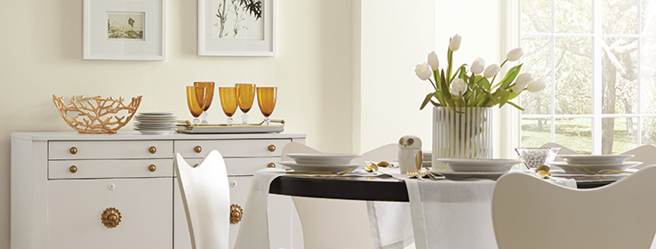
For these reasons and so many more, Sherwin-Williams has recently enjoyed an enlightening brush with simplicity — the Sherwin-Williams Color of the Year is Alabaster (SW 7008), an alluring, understated white that’s neither stark nor overly warm.
“Alabaster represents a straightforward and necessary shift to mindfulness, well-being and an atmosphere that is pure and simple,” says Jackie Jordan, Director of Color Marketing at Sherwin-Williams.
Technically speaking, white is “color without color,” shares metro Detroit–based color expert Linda Shears, ASID. She speaks regularly to consumers on color theory and psychology. “White is composed of a mixture of all the light frequencies of the visible spectrum,” Shears says. “If you pass white light or sunlight through a prism, it breaks in to all colors. However, if you mix paint pigments of those colors together, you will get black-ish.”
Top artists are, of course, paint-pigment savvy, but in their world, the use of white is crucial. In The Art of Spiritual Harmony, the great modernist painter Wassily Kandinsky wrote that white offers a “harmony of silence … like many pauses in music that break temporarily the melody. It is not a dead silence, but one pregnant with possibilities.”
Through the ages, all cultures have had a positive association with white, whether cognizant of the color’s emotive powers or not. “In the Western culture,” Shears says, “white is the color of wholeness. It offers a sense of peace and a clean slate, before anything is muddied. It signifies awakening, openness, growth and creativity.”
West Coast–based interior designer Tineke Triggs, ASID, who runs Artistic Designs for Living in San Francisco, says,“I have seen a lot of Europeans use white in home décor, as it’s modern and on track with the minimalist movement.” So how do designers best transform these positive feelings we have about white to successful design?
“No doubt white is flawless, airy and pure, but be careful,” says metro Detroit–based interior designer Armina Kasprowicz of AK Design and Accents. “Some whites can look almost yellow or creamy.”
Triggs concurs, sharing that whites can look “yellow next to furniture with warm tones.” That is precisely why Sherwin-Williams Alabaster is a just-right Goldilocks fit — not too cool and not too warm.
Kasprowicz likes to layer different tones. “The walls could be a medium white and the trim a brighter white,” she says. “Tone on tone is beautiful.”
White can also be super powerful with another color, Kasprowicz says. “If you pair it with black, for example, it’s classic and timeless, and you get instant drama.”
Take a cue from Mother Nature, Kasprowicz suggests. “Look at penguins and how black pops against white. Or look at birds’ feathers — they may read white, but there are flecks of pinks, browns and grays, like in a Scandinavian look where tones of whites and grays pair with the warmth of wood and browns. In this instance, soft textures, like gray linens, make the space sing.”
White also can be a frame when used on molding. “A white molding becomes a silhouette and doesn’t compete with furniture,” Triggs explains.
As for displaying artwork, many designers concur that the best color for walls is white. “White allows the art — instead of the walls — to speak,” designer Shears says.
Whether it’s covering a home’s walls, ceilings, trim or molding, or is seen in freshly fallen snow, exotic shoreline sands or birds’ feathers, the color white is unquestionably universally appealing. “White,” says GM’s Sirvio, “speaks to every market in the world.”
Sherwin-Williams Most Popular Whites


