Close

Historic colors restore the original beauty of classic homes in old Baltimore.
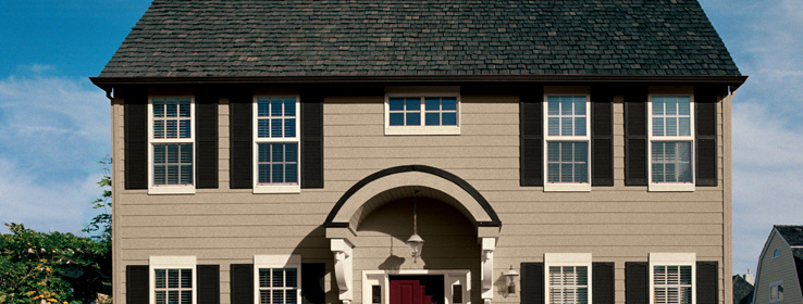
Baltimore's Guilford neighborhood is like an architectural history lesson come to life. With its tree-lined avenues, old-fashioned streetlights and stately turn-of-the century homes, Guilford is defined by its Old World charm. But until recently, one of Guilford's most prominent homes, a large 1916 Flemish Arts & Crafts villa, was more of an eyesore than a showplace. The dingy white stucco was in need of repair, the black shutters discolored by acid rain. New homeowner Julie Blewis says she heard later that the neighbors had laughed at them for buying the house. But her husband, Gordon, says, "We could see beyond the fact that it needed a paint job; that it would look great again."
While struggling with the task of selecting exterior colors at a Sherwin-Williams paint store, Julie Blewis met Leslie Webb, a historic preservation consultant who works with homeowners, architects and interior designers (a growing number of whom are being called upon to select paint colors for exterior projects). Webb was familiar with the couple's house and soon convinced Blewis that historically accurate colors would best restore its beauty. "Historic colors really define and enhance historic buildings," Webb says.
Blewis hired Webb, who began searching for evidence of original hues. She was ecstatic to discover the home's original trim color under several layers of paint on the carriage house door header. "It was the biggest stretch of preserved historic colors I've seen in the 30 years I have been doing this," she says.
Familiar Hue
Webb recognized the color as Sherwin-Williams' Rookwood Shutter Green (SW 2809), a historic color that is still available, part of Sherwin-Williams' Color Preservation Palette® series. Webb used the green for the window trim and shutters, setting it off with Roycroft Copper Red (SW 2839 – also from a Preservation Palette) on the sashes of the home's many mullioned windows. Sherwin-Williams was able to match the warm sandstone color selected for the stucco directly from the original color unearthed during Webb's research. To ensure maximum durability, the couple chose Sherwin-Williams' Duration® coating, which covers in one coat on repaints.
The new palette sets off the home's terra cotta clay tile roof, exterior brickwork and walkways. It also integrates the colors of the home with the colors of its unique setting (directly facing a large public garden), which reflects the Arts & Crafts period's philosophy of celebrating nature by employing natural colors and materials, Webb says.
Inside Warmth
Webb's work on the Blewis home attracted the attention of the owners of a 1925 Colonial Revival home, also in Guilford. Architect Jonathan Fishman and his wife, Gail, who develops exhibitions for museums, definitely have the taste and color sensibilities to select hues for their home's all-white interior spaces. "Yes, we do," Jonathan Fishman laughs, "but we couldn't agree."
Using Sherwin-Williams SuperPaint® Interior Latex in a flat finish, Webb transformed the home's interior, choosing both historic and modern colors to showcase the Fishmans' contemporary art and modern furnishings. Webb chose Versatile Gray (SW 6072) for the foyer, set off by Pure White (SW 7005) woodwork, which continues through the home. "Gray was an important color for the period of the house, which immediately linked the past to the present," she says.
The living room was painted Empire Gold (SW 0012) to infuse the space with warmth. Ruskin Room Green (SW 0042) was chosen for the dining room because it complemented the gold, as well as the Fishmans' artwork and antique oriental rugs. Webb takes a flexible approach to historic color, sometimes combining colors from different periods. The green in the Fishman home, for example, is part of Sherwin-Williams' Preservation Palette from the Arts & Crafts period, while the gold is part of the earlier Victorian palette, she notes.
But Webb is firm in her commitment to historic colors overall as an important part of preservation. "In America, we live in a throwaway society that has torn down much of its old architecture," she says. "Historic buildings add a richness and depth to life, and historic colors help them stand out against the colors of today's world."
When a Home Has a Past
Preservation consultant Leslie Webb offers the following tips when working on historic preservation projects:
Expose the original colors. Webb uses a variety of scalpels to carve an angled "tree ring" into painted surfaces to reveal layers of history. (She recommends the book "Paint in America: Colors of Historic Buildings" by Roger W. Moss and published by the Preservation Trust, which details this technique.) If the original paint color isn't feasible, consider using the second or third paint color, or adapting the original color in a way that is sensitive to the past, such as reducing the value by 20 percent.
Explore tax credits or other financial incentives for using historically accurate colors. "Each historic district has its own rules," Webb says. A good place to start is the local historic preservation office. A critical resource for preservation guidelines is the National Park Service.
Learn about the period in which the home was built and the colors that were used at that time. "Historic paint color theory is deep and complex - every period is unique," Webb says. For quick reference, consult Sherwin-Williams' Preservation Palettes.


