Close

A designer creates a color compromise for a couple with seemingly irreconcilable differences.
They say love is blind. But not when it comes to wall color. Newlyweds Jeff and Kayla Gomes were eager to decorate their new townhouse on Hawaii's Oahu Island. But there was a hitch: They were far apart on the color spectrum. "My husband and I are polar opposites. I wanted bright colors, and he wanted subdued colors," says Kayla. The couple tried creating their own compromise but soon got stuck. Jeff even bought some paint in red and brown and tried to do it himself. "But I didn't know how to put it together," he says.
So the Gomeses hired interior designer Patti Bruce to help them find common ground. To get started, Bruce gave Jeff and Kayla what she gives all of her clients: homework. "I have them go through magazines, tearing out pictures and marking things up. I want to know what they like and why, and also what they don't like – everything from furniture to fabric to color," Bruce says.
The process is critical for helping clients imagine the possibilities for their space – and helping her create a design that reflects their unique personal style, Bruce says. It's particularly useful for couples with dissimilar tastes. When people select images from magazines, they begin to piece together elements of their own style, often without realizing it, she says.
"They can see something and say, 'I like that, and I like that,' but it's amorphous. Their homework helps me define who they are. I end up showing them what their style is."
Make It Modern
The Gomeses had some common ground on which to build: Both wanted a modern look. "No Hawaiiana," Kayla says, referring to an aesthetic popular on the islands that incorporates tropical themes; earth-tone colors; and bamboo, rattan or grass materials. "We both wanted to take risks," she says. "We didn't want something traditional. We wanted to show our creativity."
The trouble was they wanted to show it with different colors. Jeff chose sample designs that were monochromatic, while Kayla chose a lot of bold patterns, high-contrast designs and strong colors. "When Kayla found a photograph of a room with bright green walls, Jeff rolled his eyes," Bruce recalls.
Bruce's challenge was to find a way to marry Jeff's and Kayla's divergent tastes into a cohesive design. The key turned out to be a colorful piece of artwork in the living room, which Jeff had purchased before he and Kayla married.
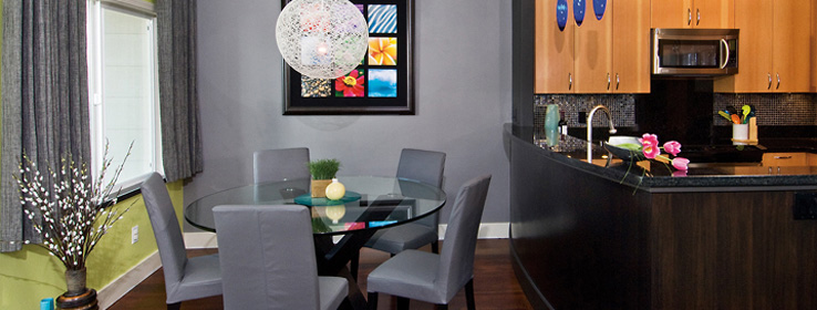
The art – a vibrant photographic collage of river rocks, flowers, a cave and other natural elements – offered Bruce something organic to work with and gave her an "open door" to use Kayla's choice of green (Impetuous SW 6916).
Still, Bruce says, she needed to use bold color in a sophisticated, understated way. "I didn't want Jeff to come in and say, 'Oh, this house is so full of color, it makes me dizzy.'" Bruce says she reminded Jeff and Kayla that, much like a relationship, interior design is ultimately about the big picture.
Knowing Jeff was nervous about the green wall, she focused her attention on the rest of the house: the draperies, the floor, the accessories. Another magazine image the couple had both chosen showed a room with a long, dark gray drape. So Bruce chose the same gray color (Iron Ore SW 7069) for the wall adjacent to the green.
"It helped to balance and tone down the green wall, so that when you walk in, it doesn't pop out at you and scream, 'I'm lime green!' But still it punches it up and adds interest," she says.
For the family room, Bruce used a neutral palette of light gray (Dovetail SW 7018) with white (Elder White SW 7014) trim, then added color through accessories, such as pillows and storage boxes.
Bruce chose Sherwin-Williams Duration Home® washable coatings because of their low-VOC (volatile organic compounds) content. "It's a good coverage paint," she says, adding she's been "thinking green" for years.
Making decisions about the other design elements showed Kayla and Jeff how the colors helped unify the design. "I presented it to them as a whole package," Bruce says. "And then [they] have to trust."
The Gomeses are glad they did. "Overall, it came out great," Jeff says. "There was some compromise. But that's marriage!"
Helping Clients Compromise
Creating a home design for a couple with disparate taste requires vision and patience. Oahu-based designer Patti Bruce offers the following advice:
Do the homework. Bruce asks her clients to go through magazines to find designs they like. "It shows them how both of their ideas can be incorporated," she says. "Couples usually do have a common thread somewhere; the trick is discovering it."
It takes two. "It's important to make clients feel that both of their wants are important," Bruce says.
Keep the faith. Encourage clients to have confidence that the individual design elements can be married into a beautiful whole. Ultimately, Bruce says, "They have to trust in the designer to execute [their] dreams."
Colors
Dovetail (SW 7018)
Elder White (SW 7014)
Impetuous (SW 6916)
Iron Ore (SW 7069)


