Close

Bright, bold colors transform an all-white home into a Mexico-inspired marvel.
When Brenda Hoskins was studying interior design, the joke among her peers was that her idea of a monochromatic color scheme was using just one color wheel. She found a like-minded client in John Burciaga, who recently hired Hoskins to transform his Phoenix house into a welcoming home for his new wife, Linda Lu. Before Hoskins, owner of the Scottsdale, Ariz., design firm Fine Library Resource, came on the scene, Burciaga's 1,900-square-foot home was painted entirely in Navajo White. Now its walls are covered with 11 different colors, with nary a white among them.
After conducting separate "color interviews" with the newlyweds, Hoskins combined their favorite shades to create an eye-popping palette that ranges from rich red to vivid violet to tangy tangerine.
Architectural Focus
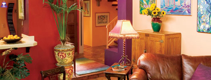
Beyond the sheer boldness of the palette, what stands out is the way Hoskins uses color to detail architecture. "After I have the palette, I like to sit alone with the building and see how it's put together," says Hoskins, who is an architectural illustrator as well as an interior designer. "I have a big wad of colors that I know my clients like, so it frees me to look at planes and columns."
Throughout the home, Hoskins uses color to highlight existing columns, beams and windows – even stair risers – in a technique borrowed from renowned Mexican architect Luis Barragan. But then she goes further, using color to create new architectural shapes that salute both the owner's Mexican heritage and the landscape.
"In the main living room, the tangerine shape is symbolic of a Native-American pueblo," Hoskins says. "The red of the bar that slices through the blue wall is meant to symbolize the red rocks of Sedona. And the blue on the ceiling takes the mountains up to the sky. As you're sitting in the living room, you should have the feeling that you're completely surrounded by Arizona."
Throughout the project, one of Hoskins' biggest challenges was getting the darkest colors in the palette, particularly the Rave Red and Kimono Violet, to appear as rich on the home's surfaces as they appeared on the sample card.
"Sherwin-Williams paint, to me, has the richest palette," Hoskins says. "But we needed several coats of Rave Red on the master bedroom ceiling to get it how we wanted it."
The room's popcorn ceiling was the major reason. "Popcorn ceilings always soak in wetness," says Terry Cox, assistant manager at the Sherwin-Williams store on Cave Creek Road in Phoenix, and the person who mixed the paints for the Burciaga home. "That's why they take numerous coats, regardless of the color."
A Range of Finishes
Hoskins used Sherwin-Williams' SuperPaint® Interior on surfaces throughout and, depending on the natural light and aesthetic expectations in a given room, chose flat, Eg-Shel or gloss finish.
Color's capacity to change with the light, although challenging for a designer, is also one of its most exciting features, Hoskins says. "An all-white house doesn't change much in the course of a day. But with color, it changes all day long. The shadows and the light are constantly moving. Then, at night, when lamps are next to the walls, you get these very rich pools of color. It's wonderful."
Color Matchmaking Tips
Conduct a "color interview."It's the first thing Brenda Hoskins does when working with a set of new clients. Interview family members separately so each person reveals his or her own color preferences and isn't influenced or overshadowed by other family members.
Create a palette built on shared preferences. "Her way of getting us to identify the colors we liked individually really helped," says homeowner John Burciaga. "Once we saw what we had in common, we knew those were the colors we wanted in our home."
Bring out the boldness in your clients. Hoskins used her Sherwin-Williams color box to help family members see color possibilities. "That makes it easier to encourage clients to take big color risks."
Use a gray-tinted basecoat under some bold colors. The Sherwin-Williams Color Prime– System provides a continuum of gray shades that maximize color and coverage for certain deep, bright or transparent paint topcoats.


