Close

A color designer uses Sherwin-Williams coatings to replicate the rich colors of South Asia in a Las Vegas home.
When a homeowner contacted Mary-Frances Cimo with her vision of an India-inspired home, the Las Vegas-based color designer immediately went to work selecting bold paint colors exclusively from Sherwin-Williams. Cimo, a member of the International Association of Color Consultants , explains how she worked with the client to meet her needs, her philosophy behind the color palette and bringing the entire scheme together.
STIR: What kind of color palette did your client request?
Cimo: She lives in a 5,000-square-foot custom home in Las Vegas that has a lot of stone and extravagant ironwork, but the colors were very neutral. She had just returned from a trip to India, which turned out to be a very spiritual journey. She wanted to be inspired in her home in the same way, by incorporating the colors she'd seen there. In addition, she had furniture imported from India so she could continue the whole look and feel.
STIR: What was your starting point?
Cimo: I had remembered that Sherwin-Williams offered an India-inspired palette as one of their collections, so I pulled colors from there and selected other ones that aligned with it. I brought Sherwin-Williams oversized 7" x 8" samples of these colors to my client at her home. She was very excited about them and told me that they really captured the flavor and feel of her trip.
STIR: Did you run into any problems?
Cimo: The homeowner was completely neutral-averse and wanted to go all out with these hot, vibrant colors. That became a challenge because when you're working in a home that is so big and has one high-impact room after another, you want to avoid repetition. The key was to use the same type of intensity in color, so when you go from room to room in this house, each one has an equal amount of color impact.
STIR: How did your client react to the end result?
Cimo: She said, "I have no idea what my friends will say when they visit me, but I love it!" And her guests were blown away. Even though the colors may not be what they would choose for their own homes, they knew it worked. This project shows that it's important to be true to your own color intuition.
A Room-by-Room Guide for Cimo's Color Choices
Foyer and Formal Living Room
Colors used: Gingery (SW 6363) for walls, Sable (SW 6083) for niches
Cimo's thoughts behind the space: I chose Gingery because it was the closest thing to a neutral we were going to get in doing a vibrant color palette. We used Sable for the foyer's built-in niches, including one that had a white-stone Buddha statue. It really made it a place of honor.
Upstairs Hallway
Color used: Curry (SW 6671) for walls
Cimo's thoughts behind the space: For the upstairs hallway, which you can see from the main level, I went with Curry. It's subtler than the Gingery and lightens up the space.
Dining Room
Colors used: Maxi Teal (SW 6769) for walls, Gold Crest (SW 6670) for ceiling, Creamy (SW 7012) for ceiling trim
Cimo's thoughts behind the space: The homeowner wanted this space to feel special and dramatic. In choosing the Maxi Teal, I wanted something that would serve as a complementary color to the orange tones of the Gingery in the foyer and living room. The Creamy trim creates a banding effect, and the Gold Crest ceiling brings a sense of warmth to the room.
Master Bedroom
Colors used: Butternut (SW 6389) for walls, Chrysanthemum (SW 6347) for ceilings in bedroom and adjacent sitting room, Flower Pot (SW 6334) for sitting room walls, Creamy (SW 7012) for ceiling trim
Cimo's thoughts behind the space: You enter the bedroom through the sitting room, which has a fireplace, chaise and beautiful paintings. I wanted it to feel like a warm, rich, cozy place for respite. I used Chrysanthemum on both the sitting room and bedroom ceilings for unity in the two adjoining rooms. I felt that the bed, with its silk scarves and touches of glitter, should be the highlight of the room, so we used Butternut to complement it.
Master Bathroom
Colors used: Butternut (SW 6389) for walls, Chrysanthemum (SW 6347) for ceiling, Vigorous Violet (SW 6838) for bathtub alcove
Cimo's thoughts behind the space: Because of its proximity to the master bedroom, the master bathroom features a similar color palette. The Vigorous Violet sets off the alcove area to make it more interesting and a focal point of the room.
Meditation Room
Colors used: Radish (SW 6861) for walls, Saffron Thread (SW 6663) for ceiling, Creamy (SW 7012) for ceiling trim
Cimo's thoughts behind the space: The room features an altar that my client imported from India. A richly colored Indian rug covers the floor. It's a very sacred space for her, so we wanted to be sure that the colors reflected this with the spiciness of Saffron Thread and vibrant red of Radish.
Daughter's Bedroom No. 1
Colors used: Curry (SW 6671) and Eros Pink (SW 6860) for walls
Cimo's thoughts behind the space: The two colors create a vibrant combination and play up the pink bedding and a turquoise chest.
Daughter's Bedroom No. 2
Colors used: Hot (SW 6843) and African Violet (SW 6982) for walls
Cimo's thoughts behind the space: In children's bedrooms, people will often go for the pastels, and when they do venture into the bright colors, it's more in a Disney-esque kind of way. We were able to maintain the Indian feel that's found throughout the rest of the house, while still showing that this is a little girl's room.
Laundry Room
Color used: Dynamo (SW 6841) for walls
Cimo's thoughts behind the space: We figured that if we had gone to all this trouble to paint the entire house, why not add a hot pink color to the laundry room? White cabinets are set against the Dynamo, making the space really gorgeous.
Office
Colors used: Fine Wine (SW 6307) and Kendal Green (SW 6467) for walls
Cimo's thoughts behind the space: The Fine Wine serves as the accent wall, as it settles all the tangy colors in the pillows on the couch and grounds the room. We used Kendal Green on the other three walls to highlight the artwork and beautiful couch.
Guestroom
Colors used: Bosc Pear (SW 6390) and Sable (SW 6083) for walls
Cimo's thoughts behind the space: The Bosc Pear is a warm golden hue, while the Sable serves as an accent wall for the gorgeous furniture from India.
Exercise Room
Colors used: Ruskin Room Green (SW 0042) and Forward Fuchsia (SW 6842) for walls
Cimo's thoughts behind the space: The homeowner wanted to face the Forward Fuchsia accent wall while she worked out to really energize her.
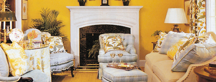
Family Room
Colors used: Yarrow (SW 6669)
Cimo's thoughts behind the space: The family room has a northern exposure, and it felt dark and dingy to my client. We used Yarrow, a yellowish color, to mimic sunlight and lift the mood of the room.


