Close

An inviting new palette makes guests — and the hostess — feel more at home.
On a Monday, with a dinner party planned for the following weekend, Ann Comer decided to make a few changes at her San Francisco home. Not simple ones, like new table linens or glassware; rather, a dramatic makeover.
"It was spur of the moment," she recalls. "My husband was having some colleagues over, and I wanted a change. I wanted to do something with color." So she contacted interior designer Shannon Kaye, whose work she'd seen in a magazine.
A shot of modern
When Kaye came for a visit, she could see that the house had great bones and classic, traditional furnishings of high quality. All it needed was a little oomph. "Then I saw a beautiful, vibrant modern painting," Kaye recalls. "I said, ‘Oh my gosh, Ann, you like color and modern design!'"
That insight inspired Kaye to create a vibrant new color palette that included soft orange, zingy citrine and deep blue green, as well as a modern citrine fabric from Robert Allen to enliven the dining-room chair cushions. Designer and client agreed to proceed with the dining room and kitchen before that weekend's dinner party. "My husband thought I was crazy," Comer recalls. But a painting crew started work immediately.
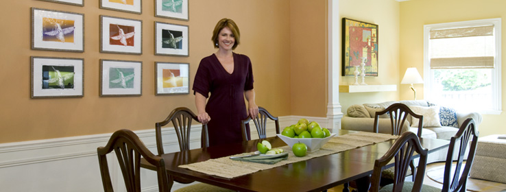
For the dining room, Kaye chose Rustic Adobe (SW 7708), a warm high-impact orange, set off by a soft white ceiling in Steamed Milk (SW 7554). Kaye's approach is collaborative, and she often works with items people already have, repurposing them for a fresh look. In the Comers' dining room, she moved out a large piece of furniture — a hutch — to open up the space. She also suggested that Comer find a collection of small artwork to showcase against the orange walls. Comer had just the thing: a series of block prints of a hummingbird that her daughter had made in high school. "It was perfect — a really personal piece of family artwork that totally transformed the space," Kaye says.
In the kitchen, Kaye had the inside of a glass-door cabinet painted Deep Sea Dive (SW 7618), a dark moody blue with a hint of teal. "It really sets off the blues and oranges in her collections," Kaye says.
A toast to the hostess
For the fast-track project, Kaye chose Sherwin-Williams Harmony® Interior Latex, a no-VOC* formulation that leaves no odor. No one at the dinner party would have guessed that the project was finished only the day before if Comer's delighted husband hadn't made a toast to the house, and to his wife, who had jump-started the transformation.
Comer herself was so pleased that she later enlisted Kaye to work her magic on other rooms in the house, including the living room, a guest room, a powder room and a bedroom for her daughter, a college student. "I wanted it to look not so much like a little girl's room, more like a grown-up suite," her mother says. "She's really happy with it. She brings her girlfriends for visits."
Comer, too, is happy with her new, color-revived home. "When I walk in, it seems so much brighter," she says. "I would never have had the guts to do it by myself. I feel so proud of it."


