Close

We ask 4 color bloggers which Sherwin-Williams colors reflect their creative philosophy.
They review it and editorialize about it for stories on their blogs, websites and magazines. They pore over publications, websites and sample books, keeping a curious eye on new hues and creative combinations. They recommend it for their clients on a daily basis. In fact, for design bloggers Maria Killam, Jaime Derringer, Ann Fox and Robin Riddle, it's pretty safe to say they're completely immersed in color.
But what colors inspire them personally in their own homes and offices? In what hues do they find motivation and creativity? Here, we get a glimpse of the homes and offices of these four design-savvy women.
Breakfast — or at least coffee — at Tiffany's
When Maria Killam, the founder and editor of the wildly popular blog Colour Me Happy, moved into her home in North Vancouver about a year and a half ago, guess which room she painted first? Her office, of course. The place where she muses about design, color, patterns, new ideas and clients' needs (she runs her own interior design firm, too). There's no down time for this dynamo color enthusiast, who's also an online color consultant.
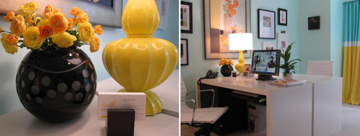
"I had to get the office up and running, and shelved," says Killam, who opted for Embellished Blue (SW 6749) for her walls. "I was inspired by the Tiffany box." She's talking, of course, about the iconic blue-hued, white-ribboned packaging for which Tiffany & Co. is famous. "It always evokes a feeling of lush and exquisite beauty."
Because Killam already had some leftover drapery fabric with that shade of blue in it, Embellished Blue was the perfect choice for the walls. Black and white frames of various sizes embellish the walls (à la Meryl Streep's office in the movie The Devil Wears Prada), while sunny yellow, in the form of faux flowers and a showpiece lamp, plays complement.
"I chose the turquoise walls because that color is great for communication and that's what I do in this office all day and all night," says Killam. Not to mention, it helps lift her sometimes rain-soaked spirits. "We get lots of rain here," she says. "Think Seattle and you get the idea."
In addition to the other design hats she wears, Killam teaches color theory as part of the interior design program at Vancouver Community College. "A color should pull the room together," she says. "This fabulous blue certainly does. I get happy every time I walk into my office. It's so fresh."
Read more about Killam's office inspiration here.
From plain to pretty
As editor of Design Milk, an online magazine dedicated to modern design, Jaime Derringer's goal is to bring readers fresh and new ideas in art, architecture, interior design, furniture and décor, fashion, and technology. Her site has been featured in the Los Angeles Times, Time Out New York, Singapore Home & Décor and Real Simple.
As you can imagine, Derringer spins in a veritable color wheel — whether she's at her computer keyboard reporting on trends, or painting the walls of her child's nursery and choosing chairs for her just-purchased home.
Working in her midcentury modern ranch-style house in Cherry Hill, N.J., Derringer herself admits to being a bit of a color contradiction.
"Although I absolutely love color — the bigger, brighter, crazier the better (hello hot pink!) — in my personal life I tend to gravitate toward the most neutral of neutrals: black, white and gray," says the first-time mother-to-be.
However, since recently purchasing a home, Derringer has come to realize it's just not realistic to live a life without color. "So I'm slowly adding it into my life," she says. "I recently purchased some bright red chairs, similar to Cherry Tomato (SW 6864)." Another pop of color breezes into her baby daughter's room, where the aforementioned Embellished Blue (SW 6749) makes for a "perfect nursery color," she says, "so soft and minty."
A family room wall will likely receive something like Iron Ore (SW 7069) to "give the room that true theater-like experience." Derringer admits that that while the hue falls in line with her old color habits, "pops of burnt orange — similar to Daredevil (SW 6882) — will come from the accessories," she explains.
"Overall, pulling myself out of my color comfort zone has been a slow process," she says, "but I have to admit it's been a lot of fun."
Derringer's office will likely be awash in Nacre (SW 6154), a white with a warm undertone. She likes the color for its nondistracting appeal. "I never leave the seat in my office. I get in ‘the zone' there and I like having a special space dedicated to work, so that when I'm outside of it (in the other rooms in my house) I can focus on relaxing and feel like I'm ‘home.' I never want to feel like I live at work," says Derringer.
Designing women
For the women of Fox + Riddle, color is as much a part of their lives as the air they breathe. And if they had to describe that air, well, they'd likely be able to give it a color. Windfresh White (SW 7628) or Open Air (SW 6491), perhaps?
Ann Fox and Robin Riddle's Dallas-based design firm encompasses their love of smart architecture, charming interiors, detailed accessories and beautiful color palettes.
Beyond designing interiors, which have been featured in dozens of publications, Fox and Riddle also blog about their ideas and inspirations at foxandriddle.com/blog.
"I enjoy blogging, reading blogs or reading design mags in my kitchen with a cup of coffee, early, before anyone else is up," says Fox, whose kitchen is steeped in icy gray and bright white with accents of lime-green to bring out the foliage of the cooking herbs.
Prior to her recent home remodel, Fox's kitchen was painted Lively Yellow (SW 6702). "I loved the pop of this lime-yellow color in contrast to the classic Carrera countertops," she says. "This color is almost a neutral for me, as it works for all seasons and decorating styles." But for the remodel, Fox did a 180 and selected Silverpointe (SW 7653). "It's a distinctive yet peaceful gray that really sets off my white marble."
Fox — a former editor and stylist for many magazines, including Country Home and Southern Living — also loves nothing more than spending a Sunday afternoon sitting in her seascape-inspired home office. Immersed in corals, crisp whites and aqua blues — all colors of the sea — Fox's workspace is as warm and cool as the sands and waters along the Texas Gulf Coast. Coral wallpaper backs the bookcases of her design library, while a bamboo desk chair is bathed in turquoise and features a white fur seat.
Fox's home was — for 10 long years — "a cheery color box of pinks, greens and blues, which worked well with my flea market finds and vintage peeling-paint furnishings." But during the remodel, the colors of the sea called to her and she answered. "These hues inspire me to breathe and relax, and they work well with my updated furniture, which has crisp, clean lines," says Fox.
As for her design partner, Riddle, the color blue plays a hushed but starring role in her work environment.
"I work in a small, sunny room with white walls, white slip-covered chairs and a glass desk," Riddle says. "My desk accessories, pillow and artwork are different patterns and textures of pale blue. The palette is oh-so-calming to clear my mind and get me focused." The colors are similar to Snowbound (SW 7004), Sky High (SW 6504) and Atmospheric (SW 6505), she explains.
Riddle's design projects, styling work and own home have been showcased in several national magazines. Her kitchen was featured on the cover of Kitchen Makeovers. A far cry from her teenage days spent basking in a Laura Ashley-esque bedroom peppered with dusty pink accents, Riddle has lately been loving the neutral backdrop of cool, taupe grays, like Agreeable (SW 7029) and Useful (SW 7050).
Repose Gray (SW 7015) with Pure White (SW 7005) trim dresses her living room. "The room's mix of grays — both light and charcoal — with raspberry fabrics and accents of antiqued mirror and chrome, allows me to have strong pops of color through my accessories."
The living room leads into her kitchen, a stunning space with Pure White (SW 7005) walls. "This crisp foundation for the walls and cabinets is grounded by countertops of honed black granite." It's that clean-slate, black-and-white combo that once again invites everyone's friend — color. A chartreuse faux-leather banquette with chrome nailhead trim sits invitingly beneath a Roman blind in a gray, chartreuse and pale-blue pattern. "That pale blue," says Riddle, "comes full circle, as it carries right through into the pale blues of my office."


