Close

A theater restaurant makes a design statement as dramatic as its setting — and breaks a 'tried and blue' rule along the way.
Cue, the new restaurant at the Guthrie Theater in Minneapolis, is sophisticated, glamorous and very blue. The deep, saturated color envelops you like an indigo embrace. And while blue is the hue most cited as people's favorite, it's often avoided by the food-service industry because it's considered an appetite suppressant.
"Blue is not a great food color," concedes David Toay, regional vice president for Bon Appetit, the restaurant-management company that developed Cue. "I was opposed to it. There really isn't any true blue food."
But Toay was trumped by Jean Nouvel, the celebrated French architect who designed the $125 million theater (his first project in North America), which is blue inside and out. Its distinctive shade, somewhere between midnight and cobalt, nearly disappears against the evening sky, leaving a magical glow of lobby lights and silvery images from past Guthrie productions, which are screened onto the building's facade.
Nouvel had submitted his own design for the restaurant, but the theater's board of directors thought its edgy nightclub vibe might intimidate some theater patrons, who range from urban hipsters to families attending a matinee of A Christmas Carol.
"A hospitality environment has to be friendly and welcoming," says architect and interior designer Ira Keer of the Durrant Group, who led the design of Cue. "We walked a fine line, trying to create an elegant restaurant that was also hospitable." Keer's original design for Cue, chosen by the Guthrie in a competition, included dramatic, themed feature walls; decorative elements; and lipstick-red accents. "[Red] is a good food color, and it's theatrical," he says.
But Nouvel's office, which had to approve all aspects of the Durrant design, envisioned something more stark, more minimalist – and more blue. "He wanted the restaurant to be a reflection of the building," says Keer, who ultimately found a way to create a welcoming environment within those parameters. "We were gifted with a wonderful space that he created for us" – a horseshoe-shaped room with 25-foot-high glass panels overlooking the Mississippi River. "Blue doesn't bother me. Any rule can be broken successfully."
The success of Keer's final design included keeping the blue primarily on the perimeter of the space, while the heart of the restaurant features a more neutral palette of silver and black, with blue used sparingly as an accent, such as in the flecks in the granite bar tops. The walls and elaborately soundproofed ceiling were painted blue, custom-mixed to match the rest of the theater using Sherwin-Williams Color Accents® alkyd in a satin finish. "The paint had to be washable because of grease spatter and drift," Keer says. "The painted surfaces are close to the kitchen." Accent hues, painted with Sherwin-Williams Color Accents alkyd and ProMar 200XP™ latex, included Black Magic (SW 6991), White Pepper (SW 1912) and a custom-mixed shade of gray.
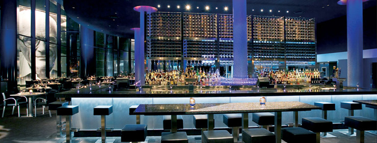
Cue exudes drama, thanks to its theatrical lighting and reflective surfaces. The Waldorf show kitchen, which echoes the theater's thrust stage one floor above, is a shimmering performance space all its own, clad in cobalt blue glass tiles and a curving LED light panel. Interior columns were wrapped with a wall covering made of polished aluminum fibers that are lit in the evening to glow blue, with magenta and gold halos. The bar is set with illuminated "coasters" – fiber-optic lights with dichroic lenses on their surface, so that they appear to be different colors when viewed from different angles.
A huge stainless-steel wine tower, designed by Keer, creates a gleaming focal point as well as a dividing wall between the bar and the dining room. Even the tabletops cast a glamorous spell, thanks to the reflective twinkle of crushed glass, silvered mirrors and quartz embedded in their surfaces.
"We had decided upfront to eliminate table linens," Toay says. "We looked very hard to find a product that gave [the tabletops] a magical quality."
Ultimately, the project limitations became a source of inspiration, Keer says. "As designers, we rely on color to help create a mood. It's so simple. But it's almost a handicap." Faced with a restricted palette, Keer became more creative in his use of patterns, materials, textures and lighting. "Because we did not have the option of color, we had to look in different directions," he says.
Bluer Than Blue
One of the biggest design challenges the Cue team faced was trying to keep Jean Nouvel's blue consistent across different materials and textures.
"How do you go from flat glass to crushed velvet?" Keer says, referring to the blue tile on the Waldorf kitchen and the custom-dyed blue curtains covering the wall on the theater side of the restaurant, which serve both an aesthetic and acoustic purpose. "Even when the blues match, they read differently because of the different textures."
For example, the ceiling paint appeared darker in the samples than it did when applied, and it now looks a shade lighter than the adjoining wall. The blue tiles picked up green and gold tones from the reflected river view.
But instead of fretting about the subtle variations, Keer embraces them as a positive. "I find the drifting of blues welcoming. It's less than perfect, and that makes people feel more comfortable."


