Close

Color speaks volumes at the new Seattle Central Library, a modernist showcase that breaks the mold of what a library can be.
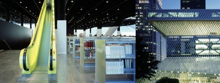
There's nothing hushed or whispered about the color scheme for the Seattle Central Library, which opened in May 2004 to great fanfare. The exuberant, deconstructivist design, by 2000 Pritzker Prize winner Rem Koolhaas and his team at Office of Metropolitan Architecture (OMA), defiantly challenges the traditional library persona of an unobtrusive brick box. From the asymmetrical glass exterior to luminescent escalators, the design is as loud as a rambunctious schoolkid. But perhaps no other element is as vocal as the colors drenching almost every surface.
Koolhaas' Netherlands-based firm embraces color, which, while not uncommon in Europe, is more unusual in American architectural firms. According to Josuha Ramus, Koolhaas' partner, color can punctuate design, buttress function and - in the case of the library - transform materials as mundane as cement floors and acoustic ceiling tiles into a sophisticated design scheme.
Colorful Clusters
The library project was sectioned into five clusters, each designed independently with a unique palette inspired by function.
For example, the team wanted elevators and escalators to be obvious to visitors, Ramus says. Fluorescent chartreuse was selected for its sheer unavoidability. "It was the one color you would see from anywhere."
The library board and advisors were generally supportive of the bold vision, but "there were certainly colors that were a hard sell," Ramus says.
Mixed to Match
More of a concern was how to achieve the robust colors and match selected shades, especially in the many areas where the same color was used on adjacent but different construction materials. Restroom surfaces had to blend seamlessly from polyurethane floors to latex walls to enamel ceilings. At the escalators, matching the difficult-to-adhere gloss illuminated panels and baked enamel panels took tremendous coordination and perseverance, Ramus says. Sherwin-Williams' Polane® two-component urethane ultimately got the job done with its bond-to-almost-anything capability.
The Sherwin-Williams blue chosen for the expansive structural areas that tie the clusters together was selected for both form and function. "On an overcast day, the color is very warm," Ramus says; on sunny days, "it's almost luminous." Exterior applications of the color were achieved with Sherwin-Williams' Corothane® 1, a moisture-cured polyurethane that could be applied even on soggy days to keep the project on schedule.
Custom Made
Craig Obert, store manager of one of the Sherwin-Williams stores in Seattle, oversaw the creation of 17 custom colors, mixed to match metal, paper and fabric swatches, that could adhere to everything. "It was a big challenge because most of the colors were very bright and vibrant, more like ink colors than paint," Obert says. To ensure long-term gloss and color retention, the store supplied Hi-Gloss Polyurethane for the deep reds of the Meeting Level.
Apparently Obert and his staff got it right. The OMA team was so committed to Sherwin-Williams' paints and colors, and their high-performance reputation, that they were specified on all bid documents.
Color expert Jill Pilaroscia, of The Colour Studio in San Francisco, described the library's saturation of color as "spectacularly fresh and surprising. Libraries are traditionally places where you don't raise your voice, you walk softly and speak quietly," Pilaroscia says. OMA's design is "blowing the top off those experiential constraints."


