Color plays a powerful role when designing a small city at sea.
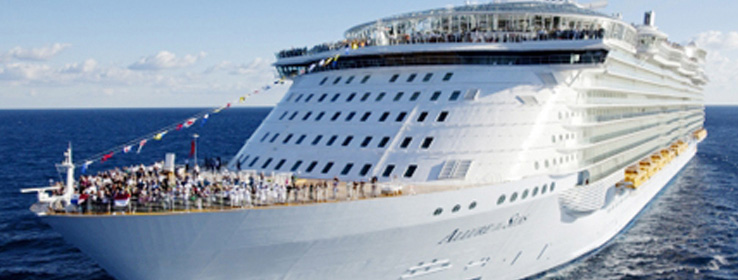
When passengers first board Royal Caribbean's Allure of the Seas, eager to start their vacation, they notice the vibrant colors of its festive spaces and the subtle hues of its tranquil spaces. But the most important color might be the one most passengers don't notice at all: the one that dominates the stairs that take them to and from their stateroom for the duration of their cruise.
"Color is important to how we handle vertical flow, from the first day they arrive on board," says Kelly Gonzalez, the cruise line's assistant vice president, architecture and design. "All the guests arrive in a tight time window. They're tired, they're hungry, they're waiting for their luggage." And they're also trying to find their way around a huge, unfamiliar ship.
And Allure, launched in 2010, is huge, even by today's mega-ship standards. With 2,700 staterooms; a passenger capacity of 5,400; and a total capacity of about 8,000, including crew; Allure and its sister ship, Oasis of the Seas, are currently the largest cruise vessels in the world. "You're building, effectively, a city," Gonzalez says.
For that reason, architects and interior designers were deeply involved in the ship's design even before it was on the drawing board at the shipyard. "There are many aspects of design that are unique to cruising," Gonzalez says. "You have a captive audience, and you have to study flow and human patterns in much more detail, so the on-board experience is positive."
For design purposes, the 16-deck vessel is divided into four quadrants, with two vertical cores at fore and two at aft. Each quadrant has a stairwell with its own signature color, which appears on the accent wall and in the artwork, as a subtle, way-finding guide. "It's noticeable to some, not all," Gonzalez says. "We find ways to aid people. Some relate to visual cues, like color, more than others."

Seven Neighborhoods
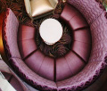
Color also helps define the personality of Allure's many recreational spaces. The ship was designed with a "neighborhood concept," including seven distinct districts, each with its own color palette.
"Each guest is individual, with different expectations for a cruise," Gonzalez says. "Some are active and athletic. Some want a much more tranquil and serene experience. Some are families with young children. Allure has to cater to all of those guests."
The Central Park district, for example, is a restful oasis of trees, specialty restaurants and a wine bar, and sets a tranquil tone with subtle, organic colors: soft greens and earth tones.
Boardwalk, a family-oriented district that includes the zip line, the carousel and the Aqua Theater amphitheater, features "brighter, more festive colors intended to energize you as part of the experience," Gonzalez says.
The Aqua Theater, where guests enjoy both ice and water shows, has a palette of Wedgwood blue, soft orange and chartreuse. "These colors are intermittently scattered throughout the space like confetti, to reinforce the carnival atmosphere we wanted in a Boardwalk," Gonzalez says. "It does tug on the nostalgia strings a little, but it's fresh and energizing at the same time. It's hard to put that combination together, to blend those converging styles."
Another factor: Boardwalk is an open-air space, so the sky becomes the ceiling or fifth wall. The fixed colors must harmonize with the natural atmosphere as it shifts from blue to gray to deepest midnight.

Color as Camouflage
The technical features of cruise ships also present some interesting design challenges. Evacuation vents that open to the deck below play a potentially important emergency role in the life of a ship. "Instead of trying to hide them, we make them part of the design," Gonzalez says. "All the vents are clad differently. We leverage every detail." One vent in the Boardwalk district, for example, is adjacent to a hot-dog stand, so the design team turned it into a large soda cup with a straw. The vents in Central Park, in contrast, are treated like trellised canopies, with botanical posters and laser-cut screens that are texturally painted to resemble oxidized metal.
With so many diverse environments sharing one larger space, transition areas are important, Gonzalez says. "We have to tie it all together, so you don't have a collision of things all ramming up against each other."
Borders of carpet, wood veneer and stone help transition from one space from another. Textured carpets, which appear a solid color but are really mottled – the better to camouflage lint or spills – are the practical choice for spaces in which hard stone floors are acoustically undesirable. "There are more than 100 different carpets on Allure," Gonzalez notes.
Ultimately, color is a key tool in creating a seamless guest experience, she says. "The personality of the room has to stand on its own, but we also use color so that variety and diversity can live together harmoniously."


