Close

A large wellness center focusing on massage therapy, chiropractic medicine and detoxification gets a makeover with Sherwin-Williams colors.
Close your eyes. Think about wellness. Now try to describe its color.
If your mind drifted to blue skies, green grass, turquoise lakes, clear streams, sandy shorelines, water-splashed rocks and creamy clouds, then you're thinking like one of Southeast Michigan's leading interior designers.
Those were just some of the natural elements Caroline von Weyher drew from while planning the renovation and redesign of a facility that would become a large wellness center focusing on massage therapy, chiropractic medicine, nutrition, exercise, detoxification and more.
The space occupies a historic Tudor-style home-turned-office-building designed by renowned Michigan architect Wallace Frost (1892-1962).
Frost left his mark in Michigan by collaborating with architect Albert Kahn on several large projects, including the Detroit Public Library, the General Motors Building in Detroit and the William L. Clements Library in Ann Arbor. He also practiced residential architecture in Birmingham, Mich., and left a legacy of at least 44 uniquely designed homes - dating from the 1920s through the 1950s - in the area.
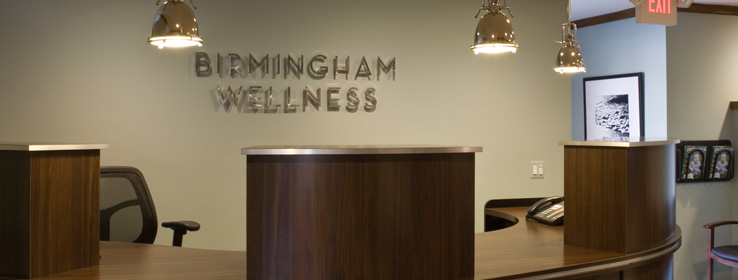
To bring out the best in Frost's architecture, von Weyher, owner of Birmingham-based Von Haus Design (www.vonhaus.com), kept all original oak trim and moldings, but updated them with a rich mahogany stain. "The trim was that nasty '80s oak," von Weyher says. Today, its deep hue is as pretty as polished river rocks.
Von Weyher and Dr. Jennifer Bonde, the center's owner, selected Cooled Blue (SW 6759) for most of the walls in the main spaces to create a feeling of peace. Rivulet (SW 6760), a tad deeper than Cooled Blue, was used in the treatment rooms, while Marshmallow (SW 7001), a warm shade of white, adorns the lobby, ceilings and bathrooms.
"We sampled at least 40 colors before arriving on these," says the designer. Adds Bonde: "Cooled Blue is non-clinical, sort of like sea foam. and changes color at different times of the day."
Von Weyher anchored the blue-green hues with rich browns and deep, ebony-toned desks, shelving and seating (HON chairs, of course — ergonomically correct for a wellness center). Black-and-white nature photos — from leaves and grass to brooks and flower pods — encased in black frames stand out in nice contrast to the walls.
Bonde's office, once a conference room, was transformed into a large, open space featuring an inviting fireplace.
Slate floors in much of the facility boast both warm and cool tones that echo wall colors and wood trim, "tying it all together," von Weyher says.
The bathrooms, now all wheelchair-accessible, blend nicely into the space. Much of the lighting is eco-friendly, turning on only when needed. Gone are the gold, brass and bronze fixtures, replaced with cool silvers and nickels that complement the paint hues, continuing the relaxing, spa-like feel.
"The carpet and the rugs look like sisal, but are actually commercial-grade, low-pile and very affordable," explains von Weyher. The center's rounded reception desk was designed in New York with a spa look in mind.
"The building hadn't been renovated in decades, and there were so many decisions to make. Paint colors played a huge role,GÀ¡¥ says Bonde. "Caroline [von Weyher] and her cheerful personality and can-do attitude helped me get through what could have been a very stressful period." Stressful? Well, that just wouldn't do for a doctor who spends her days de-stressing patients.
"We knew we could take this wonderful but outdated building and make it beautiful," says von Weyher. Says Bonde: "My clients all love our new building and its interior color. It now feels truly welcoming."


