Close


2017 Color of the Year
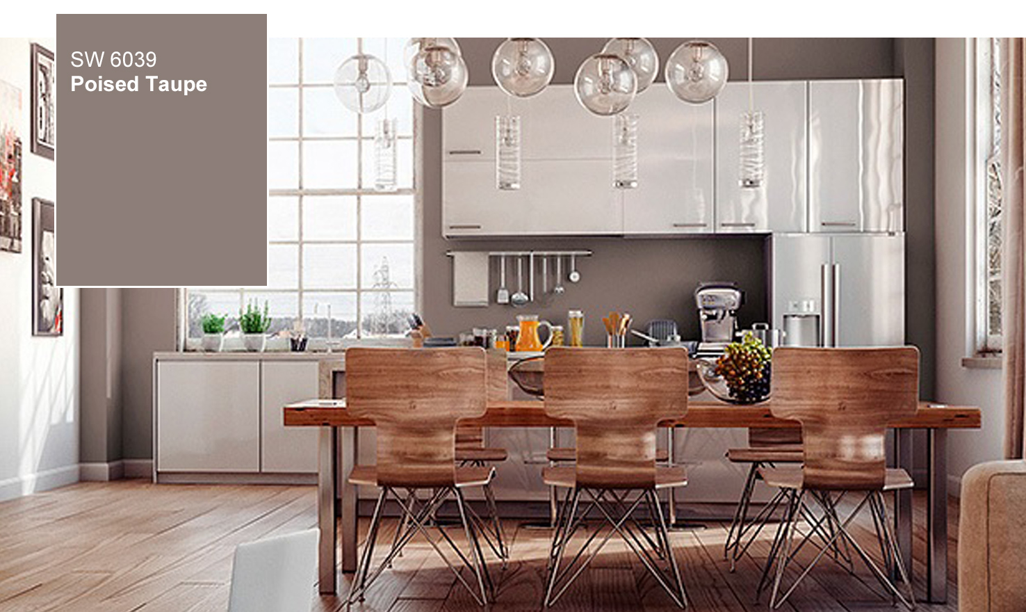
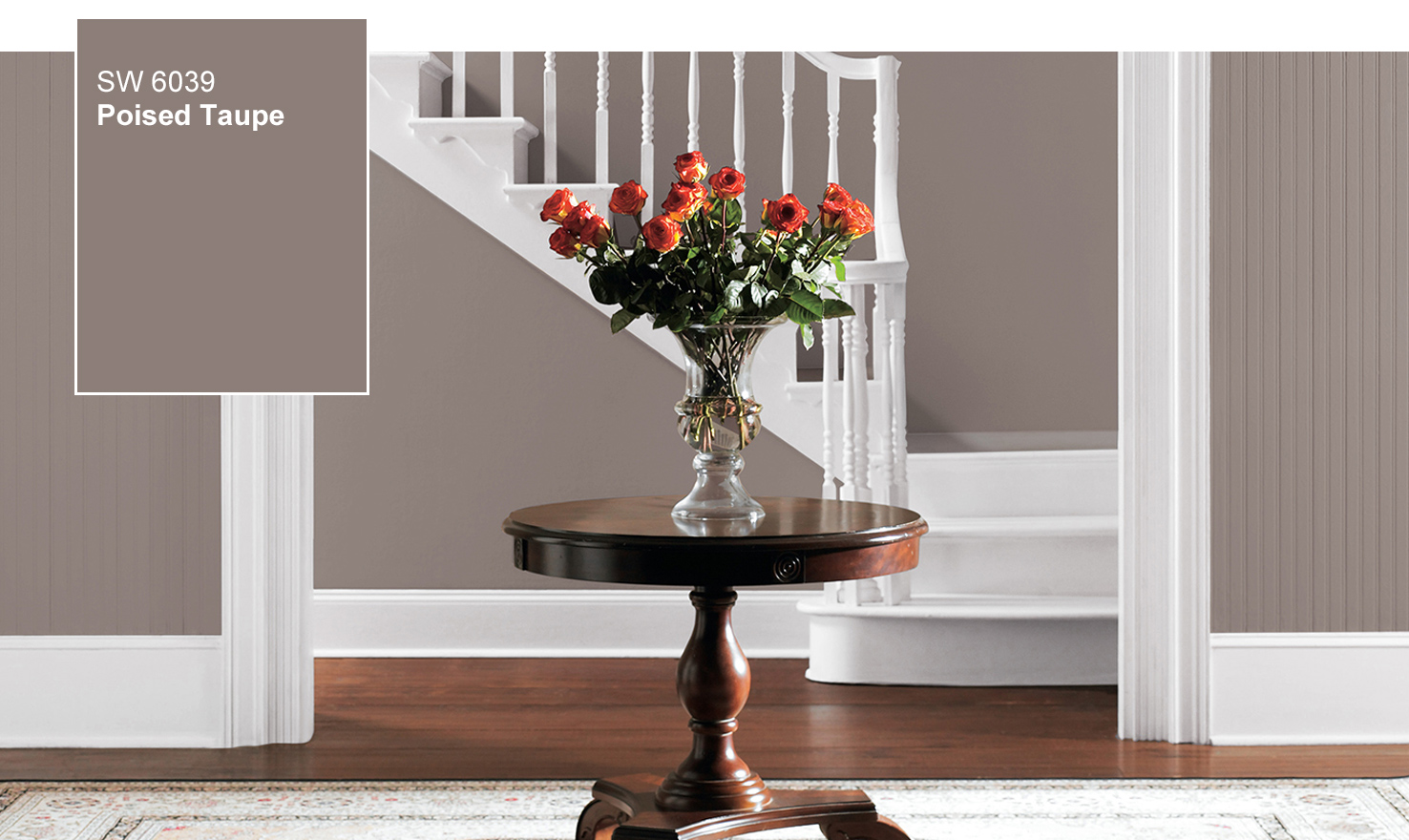
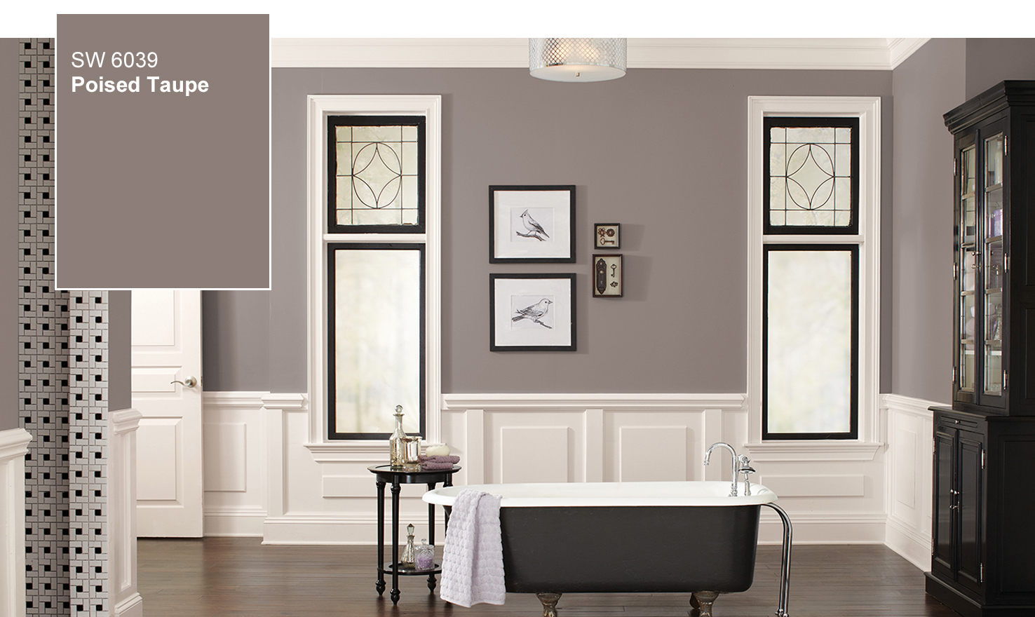
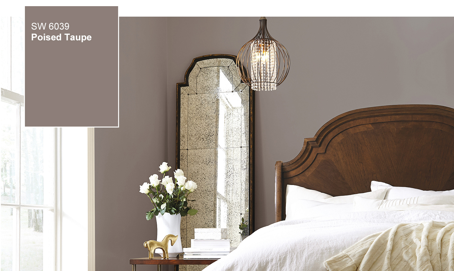
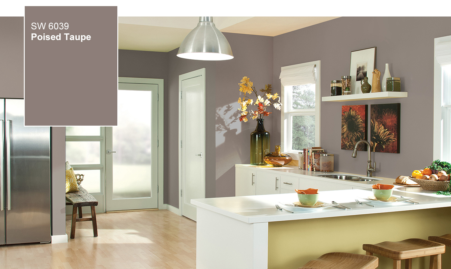
Sherwin-Williams doesn’t usually like to play color favorites, but in this case we can’t resist. The color we anticipate defining 2017 is Poised Taupe SW 6039. Here’s why: This timeless neutral is modern, classic and a beautiful balance of warm and cool.
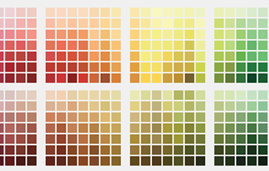
The 2016 industry shows revealed a surprising transition from grey to taupe. Both contract and consumer color and products have been focused on grey as the key neutral — although grey is still important, we have seen a significant shift in materials and finish color to warmer expressions of neutral.
Watch Our 2017 Color of the Year Unveiling Video
Using the Sherwin-Williams ColorSnap® Visualizer, you can explore the Color of the Year, and with the swipe of a finger see it on any wall.
Tag your Poised Taupe Twitter and Instagram posts with #SWCOLORLOVE or upload a photo.
2017 Key color combinations featuring Poised Taupe…
In addition to the “warming up” of neutrals in general, 2017 will see several key colors emerge in combination with taupe.
Cornflower Hues
Faded indigo and lighter cornflower hues pair with modern white and Poised Taupe for a charming palette, reminiscent of the French countryside.
Organic Re-imagined
Vegetal green, citrus green, weathered bronze and mustard yellow pair with Poised Taupe to create a contemporary organic palette — re-imagined for the modern world.
Vintage Pastels
Pastels take on a vintage vibe with dusty ink, amber, Poised Taupe, sage and oxidized yellow.
Wine & Taupe
Deep wine, purple and Poised Taupe bring warmth to the dark tones favored in 2017. Silvery grey and intense teal provide balance and drama to this rich, mysterious palette.
Eroded
Red and coral are vibrant and ore rich when combined with Poised Taupe and dusky rose. There is a natural feel to this palette, reminiscent of silt, clay and red stained bedrock.
Yellow POP
Yellow takes bold direction when paired with black, white, Poised Taupe and deep teal for a super graphic look.