Close


By Beth Rutledge
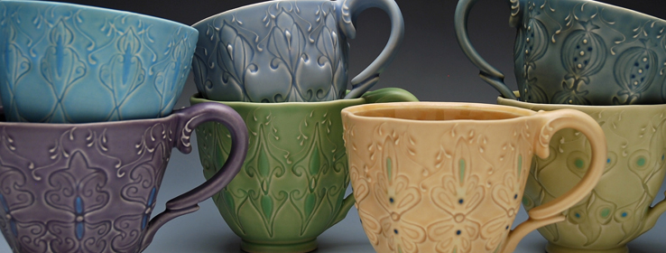
Meet ceramicist Kristen Kieffer, whose watercolor-soft pieces are the perfect balance between old-world ornamentation and modern-day utility.
Name: Kristen Kieffer
Occupation: Studio potter and workshop instructor
Massachusetts-based potter Kristen Kieffer makes functional art — cups, vases, teapots and more — that celebrates gracious forms and lush tones. In her most recent work, she plays with texture and light through vibrant, kimono-inspired patterns. An artist who "thinks about color all the time," Kristen's home is a brightly hued oasis that offers both inspiration and contrast to her work. STIR sat down with Kristen to talk about glazes, garden inspirations and how her colorful creations take shape.
STIR: What three words describe you as an artist?
Kristen Kieffer (KK): Observant, precise and playful.
STIR: "Potter" is not a common vocation. How did you forge your path?
KK: Supportive parents telling me I could be anything I wanted when I grew up certainly helped. Art was always my favorite class in school, and I grew up drawing a lot. After I took my first clay course in college 22 years ago, I fell in love with the material, and basically never left the studio.
STIR: Where do you find color inspiration?
KK: Everywhere! My perennial garden, couture clothing from every time period, cakes and sweets …
However, being inspired by color and choosing color in the world of ceramics is complicated. Choosing a glaze color is nothing like choosing a paint color, because of the basic chemistry of glaze materials. It's the difference between walking into a paint store, choosing an eggshell finish in aqua and getting it five minutes later; and having a sense that an aqua would be nice as a glaze, and performing tests to achieve the color, saturation and surface quality over a few weeks or months. And possibly not achieving the desired color at all.
In addition to the complexity of testing to achieve a certain glaze color, there's also the consideration of food or flowers being paired with the color, given I'm designing and making objects for the home. Lots of balancing goes on.
STIR: You often take utilitarian items and give them an elaborate and whimsical makeover. Why choose items like cups and plates for your work, and how do you describe them?
KK: I'm a potter who chooses to work within the parameter of functional pottery. My goal is to bring ornateness to the everyday. Adjectives I use to describe my work include elegant, graceful, sophisticated, robust, merry, joyful, voluptuous, Victorian modern and luxurious, but also functional and utilitarian.
STIR: How would you describe your approach to choosing and using colors?
KK: I like having a range of colors, so my current palette has ten different glaze colors, which is relatively high for a studio potter. The colors range from a super pale turquoise to a deep wine red, with a variety of colors in between. I want my customers to have options, but it's also because I love being surrounded by so much color.
I do tend to work monochromatically with these ten colors; I don't usually put multiple glaze colors on a single piece. I'm influenced by silver service pieces, which are very ornate but allow the form to be as important as the surface.
Three years ago, however, I did start adding bits of underglaze color — tangerine orange, lime green, sky and navy blue, and red — in the form of stripes and polka dots to serve as focal points in a piece, as well as to visually emphasize the surface patterns. This has added a playful quality to my work, I think.
STIR: Who do you design for?
KK: I design for customers and collectors who appreciate how an elegant and well-crafted handmade object can enhance daily life.
STIR: What colors make you happy?
KK: Color just generally makes me happy. I particularly enjoy saturated yet clear colors. It depends on what the color is for, but I like to see color around me. The colors I have in my house — like hot pink geranium in the bathroom — are great. Also, I'm very fond of tangerine orange.
STIR: You create with color daily. How do your personal color preferences find their way into your designs?
KK: My home is filled with bright colors, and I do think my wall colors make their way into my pots. I live in a 1920 Cape Cod?like bungalow with pine floors and moldings, which are very amber to orange, so I've chosen wall colors that complement the pine, mostly greens and aquas. I would describe the kitchen as "hula skirt green" and the living room as a "deep aqua."
I chose the wall color to complement the wood color in my home the same way I choose colors for my glazes: colors that work well together, and can be mixed and matched by customers to their fancy. I think about color from beginning to end — my view of finished pots sitting in my studio, how the pots will look as a grouping in a gallery or online, as well as how one or more colors will fit in a customer's home.
STIR: Your pieces are distinctively feminine and detailed. What's the style vibe in your own home?
KK: I've come around to seeing my work as feminine, but I also think 21st century Americans perceive ornamentation as more feminine than other cultures and other time periods, which is where I gather a lot of my inspiration: Art Nouveau, Islamic, Japanese pattern and more.
My personal style is eclectic. I own antique, vintage modern, IKEA, as well as handmade furniture. I have all artist-made art on the walls. Like most artists, I surround myself with select things I love, so my home does feel homey and personal.
STIR: Say you're having good friends over for brunch. Do you serve them using your own pieces?
KK: I only have handmade tableware, but most of it is by other potters I've bought from and traded with over the years. Some of my pots make it into the kitchen because of a flaw, but for the most part, I enjoy using others' work, and taking a break from looking at and analyzing my own.


