Close


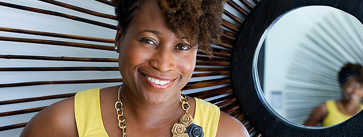
Kim Palmer
Designer Nicole White emboldens her clients to venture beyond color comfort zones.
Born and raised in Jamaica, Nicole White’s aesthetic was infused with the vibrant, sun-drenched hues of the Caribbean. She moved to New York for college, earning a journalism degree and becoming a writer. “But I’ve always had a passion for design,” she says. “I started designing homes, and 10 years later, here we are.” Now White combines her passions as principal of Nicole White Designs and author of the breezy blog Live Laugh Decorate. We caught up with her at home in Miami.
STIR: How have your Jamaican roots influenced your use of color?
NW: Caribbean folks are very colorful. That’s why I’m not afraid of color. I grew up wearing floral dresses and bold orange skirts and knowing it was OK to express myself colorfully. It’s a part of me. I don’t think I’ve met a color I’m afraid of. I tackled a very large project and the client said I was chosen because of my use of bold colors.
STIR: Tell us about a color risk you’ve taken.
NW: I’ve taken a lot of them. On that same large project, the husband said, “I’m open to pink, but not girlie pink.” So in the entryway, we used a bold fuchsia on the walls. That was the second time I’ve had adults ask me to infuse pink outside of a girl’s room.
STIR: Have you ever used a color you’ve regretted?
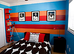
NW: Years ago, I did a room for a client’s two sons, and we used a green that, in my opinion, was intense and very neon. I didn’t recommend it. The client wanted it, so I relented. But it was so green it had a glow. Let’s just say, you didn’t need a light in that room at night. I don’t know how the kids could sleep.
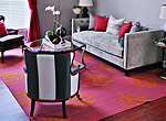
STIR: You posted a very colorful project, “Hollywood Regency,” on your blog. Tell us about it.
NW: It was a living and dining room painted very intense blue-green. The client wanted an old Hollywood feel. We were using a lot of mirrored furniture, and blue-green as an accent wall said glamour to me. I found a peacock pillow with that color on the plumage, and that cemented the direction. We used SW 6776 Blue Nile and SW 7018 Dovetail in Sherwin-Williams Emerald™ Paint on the walls. The client was not on board at first. She had visions of yellow as the accent wall. We went back and forth for weeks, and she spent a lot of money on paint samples. But in the end, she decided to trust my direction, and it worked.


STIR: What’s your go-to color when designing an interior?
NW: I use a lot of gray. Gray’s my white, my beige. I think I’ve used every gray that Sherwin-Williams makes.
STIR: Do you have a current favorite?
NW: I’ve used SW 7066 Gray Matters on several projects, and also SW 7075 Web Gray and SW 7072 Online.
Nicole’s favorite Sherwin-Williams colors


STIR: You also design parties and special events. Tell us about a recent one, the colors you chose and why.
NW: I just did a baby shower. They wanted a ladybug theme, but I didn’t want to saturate the space with the traditional red, white and black. So I brought in lime green, to cut down on the red and evoke the outdoors. We had a lime-green overlay on the dessert table; green napkins; and simple flowers and branches, to suggest a forest, as the centerpiece.
STIR: What trends are you seeing for parties?
NW: Bold colors for sure, like pops of pink, lime green and lavender. People are a lot more OK with napkins and tableware being a bold color, with more muted tones on top. And I’m seeing more laid-back parties - relaxed, not so formal, like using Mason jars instead of glasses. Folks are also getting into a vintage vibe, with lace tablecloths and loads of DIY touches to give their event a more personal feel.
STIR: What colors do you like to surround yourself with at home?
NW: Orange is my personal favorite - a nice rust orange. I also love teal. And, not surprisingly, pink - pink has grown on me this year. Sadly, emerald has never grown on me. I’m not sure why, especially since it’s the color of my birthstone, but I think it’s an intense color to infuse into a home. It’s definitely been a tough one to pitch to clients. I also love black, gray and white. That’s probably what you’ll see me wearing on any given day, though I’ll add a splash of color with jewelry, my purse or shoes. I painted the main areas of my house white a few years ago. I work with so much color that I needed to calm things down a bit at home.
NW: Orange is my personal favorite - a nice rust orange. I also love teal. And, not surprisingly, pink - pink has grown on me this year. Sadly, emerald has never grown on me. I’m not sure why, especially since it’s the color of my birthstone, but I think it’s an intense color to infuse into a home. It’s definitely been a tough one to pitch to clients. I also love black, gray and white. That’s probably what you’ll see me wearing on any given day, though I’ll add a splash of color with jewelry, my purse or shoes. I painted the main areas of my house white a few years ago. I work with so much color that I needed to calm things down a bit at home.
STIR: What colors did you choose for your two-year-old son’s room?
NW: Pale yellow and gray. I’m not attracted to blue for boys and pink for girls. I didn’t want it gender-specific. I used the same yellow and gray in my office. I did color-blocking in both rooms, in different ways. And I did it while I was very pregnant, which is not something I’d recommend! But I love painting almost as much as I love selecting paint.
STIR: What color would you never be caught dead wearing or using?
NW: Peach? I’m not a peachy kind of girl, and I will definitely never suggest that color to a client or wear it - at least not willingly.
STIR: Where do you find color inspiration?
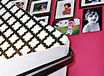
NW: I’m inspired by my love for Jamaica and the Caribbean, and for Cuban and Haitian art. I have a thing for black-and-white photography, and find inspiration in its simplicity. I visited Paris for my 30th birthday and remain inspired by the architecture and rich history of that city. I also spend a lot of time at the fabric store and often get direction from fabrics and throw pillows. Years ago, I fell in love with a pillow at Urban Outfitters and designed my bedroom around that. It was rust, silver and gold. I think I still have the pillow.
STIR: What current color trend are you most enthusiastic about?
NW: I have been very pleased to see more people embrace color in their homes. There used to be a sense that only some ethnicities use bold color, but that has definitely changed. I picked up a copy of Veranda recently - a very traditional magazine, and yet they had a bold blue wall on the cover. To see male clients open to fuchsia - that’s awesome! I also love the fact that people are taking color from fashion and bringing it into their home. That’s a trend I hope to see linger for quite some time.
Photo credits:
Photography of Nicole and the Miami Heat striped room: Noelle Theard Photography
All other photography: Circle Ten Media