Close

BY HEIDI PEARSON
Ceramics artist Whitney Smith takes color inspiration from the natural world — with delightful results.
"Heartbreak."
Few professionals in the world of color would use that word to sum up their work, but for ceramics artist Whitney Smith, heartbreak comes with the territory. "Working with color in pottery is very different than in other mediums, because glaze color is determined by factors you have little control over," Smith says. "Some people think glaze application is like applying paint. It's more like working with paint that's had a big hit of LSD, because you have no idea how it's going to act."
Fortunately for Smith, her glazes have been behaving quite nicely of late. So nicely, in fact, that the Bay Area artist now has her own incredibly prolific production studio, selling the majority of her work online (much of it through Etsy) and the rest through stores across the country and as far away as Paris and Australia.
STIR asked the ceramics star what role color plays in her work and life.
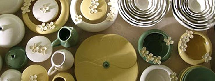
STIR: How would you describe your signature palette?
WS: That's easy — it's a variety of greens. It ranges from rich, dark greens with speckles of copper to lighter greens with rich, yellow undertones. I am very drawn to nature, and I like colors that soothe the soul and evoke an experience with the natural world. Plus, they match my design sense, which is primarily informed by my obsession with flowers and other forms found in nature.
STIR: You have a huge following. Why do your colors resonate with people so much?
WS: I think people are seeking an experience with nature. We hunger for it, especially when we are very caught up in the daily rush of our lives. Nature — whether it's a backyard garden, a tree on an urban street or a vast redwood forest — asks us to pause and appreciate its beauty and abundance. My work does the same thing.
STIR: Have specific artists or time periods informed what you do?
WS: The Arts & Crafts movement of the late 19th and early 20th centuries really influences me. The aesthetic was anti-industrial, which led to a style that was romantic and reflected the natural landscape that inspired the artists of that time. I love the decorative arts that were created during that period, such as William Morris wallpapers. I look to that time when I'm feeling depleted of ideas.
STIR: You're immersed in color all day professionally. How does color factor into your personal life?
WS: I don't like loud people, and I don't like loud colors. I always prefer meditative and soft colors, whether in my ceramics or my surroundings. You will not catch me making a statement with a bright red jacket or a fluorescent anything. I always prefer to draw people's eye subtly with depth of color. The blues, greens and soft pinks found in my ceramics are what I generally wear. People always say I match my work, and it's true. My interiors are also pretty subtle — with the exception of my living room, which is a robin's egg blue. It's kind of like living inside an Easter egg.
Get the details
You can learn more about Smith and see examples of her work at her website and on Etsy. You can also watch a video of Smith at work in her studio.


