Close


By Lynn Bronson
STIR talks with textile designer Anna Maria Horner about color, inspiration, process and more.
Meet Anna Maria Horner, a designer who's inspired legions of quilters, seamstresses and crafters to create beautiful projects with her vibrant fabrics, fun clothing patterns and innovative needlework designs.
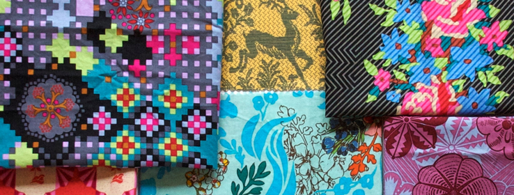
Since launching her first line of fabrics eight years ago, Horner has gained a reputation for having a unique and evocative design aesthetic. It stems, in part, from her use of saturated colors and unexpected twists on familiar themes. And while textiles are still near and dear to her heart, her artistic restlessness has led her to partner with manufacturers to produce home and gift items, write three sewing books, and publish a collection of sewing and needlework patterns.
STIR: Where do you find color inspiration for your designs?
Anna Maria Horner (AMH): Every single place you could imagine, whether obvious or not. I'm drawn to unusual combinations of colors more than I am to specific favorite colors, so my eyes just tend to notice a unique grouping, whether it's in my garden, on a walk or in an old oil painting.
STIR: How would you describe your approach to choosing and using color for your designs?
AMH: I create a lot of floral designs, so the palettes tend to start out somewhat traditional, but then I mess them up a bit by replacing a color with something less expected, either more muted or more riotous. I also really enjoy when the palette seems as though it's always been there, immediately evoking a visceral mood or a memory.
STIR: Do you have a signature palette?
AMH: Well, I like to think I'm always evolving. However, I think others would describe my palette as jewel-toned. I gravitate toward warm, vibrant hues. When I do use cooler colors, they're often in the gray-turquoise-citrus range.
STIR: You work in all kinds of mediums. How do the considerations for color change when you're working with fabric or other textiles?
AMH: I don't think of palette-making too differently when I'm going from embroidery to garment fabric to quilting. However, I'm slightly more deliberate or careful about palette when I'm designing garment fabrics. After all, it's important to choose a palette that looks good on people and is generally wearable, even if there are some daring choices within that.
STIR: Who do you design for?
AMH: Like many designers, I imagine, I'm sort of always designing for myself. But for "me" also means for my family. Our seven children range in age from 10 months to 22 years, so my four girls — their ages and personalities — very often inspire the direction my designs take.
STIR: You work with color every day. Do you find your personal preferences making their way into your designs?
AMH: Of course. How can they not? Even though I have manufacturing partners, I'm fortunate to work pretty freely. I'm generally given full control over palette and design decisions, whether I'm working on a fabric collection or a ribbon collection. The collaboration with the manufacturer is more pronounced when we're fine-tuning the final details of product selection.
STIR: Describe your design process.
AMH: Even though designing art for fabrics, ribbons and needlework designs varies greatly from designing the construction of a garment or a quilt, everything I do begins in my sketchbook. From there, artwork is colored by hand before I begin translating it into a digital process on the computer. I redraw everything in my software program. I use GIMP (GNU Image Manipulation Program), which is open-source and similar to Photoshop, so I can make and store changes without the kind of labor that hard-copy artwork would require. But I was trained as a painter and drawer in fine art school, so my sensibilities are still based in drafting everything by hand first. And while all of my work goes through several sophisticated technologies to bring it to the customer, I like to think it still carries a just-painted character to it — that you can still feel and see the human touch.
STIR: What's the style vibe in your home?
AMH: Colorful, handmade, collected and lived-in. I tend to have a "more is more" approach to color in my house! However, I keep things comfortable and balanced with various wood tones, old salvaged furniture and an emphasis on various textures through rugs, quilts and other handmade treasures.
For more images of Anna Maria Horner's designs, join our Sherwin-Williams for Design Pros conversation on Facebook.