Close

The ability to successfully create a design scheme around a favorite color is never a challenge for Thom Sweeney.

STIR first heard from Thom Sweeney, principal at New Home Interiors of Lakewood, N.J., with 20 years of experience in interior design, when he responded to our story "Gorgeous Grays." The story triggered numerous responses, especially about gray's trendy yet classic sophistication and its panache as a modern neutral, including a reply from Sweeney. Sweeney is well ahead of the curve on the appeal of gray, and has been using it for years to brilliant effect. He even has his own go-to gorgeous gray: Comfort Gray (SW 6205).
STIR: You're called the "King of Comfort Gray" around your office. How did you get the title?
Sweeney: I was dubbed "The King of Comfort Gray" by my associates, because I use this color somewhere for every one of my clients. It's a can't-miss part of any presentation. When I've specified it in my presentations – contract or residential – I've never had a client reject it.
Around the office, when I even dare to suggest using Comfort Gray, eyes roll and choruses of "'not again" can be heard. The king doesn't care. The king knows it sells! My associates have gone so far as to threaten to have my photo framed in the foyer of our office, with a crown superimposed onto my head along with the caption, "King of Comfort Gray."
STIR: What impresses you most about this color?
Sweeney: I love its Zen-like quality. When a client walks into a Comfort Gray room, the first thing they do is inhale and exhale slowly. You've heard of an "ah-ha" moment? This is the "aaah-haaa" moment. It is positively therapeutic. This is an extremely relaxing color. If I were a politician, I would propose legislation that every dentist's office must be painted Comfort Gray.
STIR: How do you describe the color Comfort Gray?
Sweeney: I would describe it as a kind of chameleon. It's not green. It's not blue. It's not gray, yet it's all of those colors. I would say it reminds me of what the term "sea glass" conjures up for me. It's that smoky, subtle patina on a piece of glass that washes up on beaches everywhere in the world.
STIR: When did you first discover it?
Sweeney: When I was designing an oceanfront home on Long Beach Island about five or six years ago, the clients said they wanted "beach-y, but not clich+¬." When I first came across the color in the Sherwin-Williams fan deck, I knew instantly how versatile it could be. Because of its chameleon-like quality, it goes with a wide variety of other colors.
STIR: In what projects have you used Comfort Gray, and why?
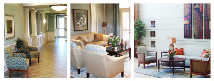
Sweeney: I've used it in the Adelphia Restaurant in Deptford, N.J.; in a beach house in Avalon, N.J.; in a contemporary Manhattan apartment; and in a low-income apartment complex just across the river in Newark, N.J. And that's the proverbial tip of the iceberg. It just works, everywhere. Everyone loves this color; it makes them feel good. You'd think I'd be sick of it, but I even painted the foyer and hallway in my home – you guessed it – Comfort Gray. It greets me each evening after a colorful day at the office.
STIR: When you are creating, is there a room where Comfort Gray is consistently your go-to color, for instance a bath or dining room?
Sweeney: I would have to say that it should be used in an area where you want to relax or entertain, so you can enjoy where you are most often. However, I have used it in bathrooms, high-rise corridors and master bedrooms. I'm doing a home in Haddonfield, N.J. where the master bedroom is Comfort Gray and the adjoining sitting area has chocolate brown, crocodile-texture wall covering. That's a smashing color combination.
STIR: What other colors go well with Comfort Gray?
Sweeney: Most of the bronze family looks great, and caramel and a lot of the sand colors for a more subtle combination. But it works with bright colors as well, such as coral and watermelon. It's also a great foil for sparkling white and indigo blue. It looks good with teal and terra cotta, too.
STIR: If you were told you couldn't use Comfort Gray, what Sherwin-Williams color would you choose in its place?
Sweeney: If the king was sent into exile and he couldn't use Comfort Gray anymore, I suppose he'd try to find another equally versatile color which is neither this nor that. And that might be a color like Versatile Gray (SW 6072). It's not beige. It's not taupe. It's not gray. And because of that, it looks like a color – and here is where you're going to have to forgive me – that I could find comfort in.
A Comfort Gray Palette
STIR asked Sweeney to create a color palette for a master suite starring Comfort Gray. Below is his vision – a rich, yet relaxing scheme featuring tones of sand, blue-gray and terra cotta.
Bedroom
Walls: Comfort Gray (SW 6205)
Trim: Dover White (SW 6385)
Ceiling: Dover White (SW 6385)
Flooring: Off-white carpet, or off-white area rug on Brazilian Cherry hardwood
Bathroom
Walls: Foxy (SW 6333)
Trim: Dover White (SW 6385)
Ceiling: Dover White (SW 6385)
Other finishes: Giallo Napoleano granite, limestone floors, espresso cabinetry
Hallway (linking bedroom and bathroom)
Walls: Bagel (SW6114)
Trim: Dover White (SW 6385)
Ceiling: Dover White (SW 6385)
Walk-in Closet
Walls: Moody Blue (SW 6221)
Trim: Dover White (SW 6385)
Ceiling: Dover White (SW 6385)
Other finishes: White built-in cabinetry


