Close

Lighting impresario Leni Schwendinger shares her fascination with illumination.
Leni Schwendinger creates dazzling, luminous environments around the world using colored lights and cutting-edge technology. Her New York City company, Light Projects Ltd., temporarily transformed a Swedish parking lot into a dynamic light park for skaters and cyclists. The permanent installation "Dreaming in Color" for Seattle's Opera House features suspended metal mesh panels immersed in colored light that plays "melodies for the eyes" composed of chromatic sequences based on classic color theory. This fall, Schwendinger built a light calendar for Coney Island's landmark Parachute Jump. Now covered with hundreds of light-emitting diodes (LEDs), the 277-foot-high former amusement-park ride changes color nightly to celebrate the boardwalk's seasons, holidays and even the phases of the moon.
You're working in such an innovative field. How did you get started?
I wanted to be a cinematographer, but ended up getting into lighting for theater. That developed into creating projections, painting on glass, doing large-scale scenography for opera. I even had a chance to work at Bayreuth. But the seminal moment was working for [performance artist] Laurie Anderson and seeing a role model. I thought, Wow, she's making it up: performance, visual art, everything – creating her own rules. After going on tour with her, I decided to stop doing commercial work and develop a body of artwork on my own.
What's the key difference between working with pigment color, like paint, and using colored light?
The biggest difference is the primary colors: With colored light, the primaries are red, blue and green; in pigment color, they're red, blue and yellow. The other thing about colored light is that it's an additive system. As you add colors, you're moving toward white; with pigment primaries, if you add colors, you move toward black.
What kind of color effects can be achieved only with light?
Light is easily transformed. You can shift colors, use dimmers. It evokes the passage of time in a way pigment color physically cannot. There's something about luminosity that is very captivating.
Some of your installations are permanent, others are ephemeral. What do they have in common?
I'm interested in creating genuinely wondrous places. There's a lot of manufactured wonder in our culture, but it's highly controlled. I try to bring other impulses to my work, like the principles behind the design of Japanese stroll gardens, which are all about "happening onto" something.
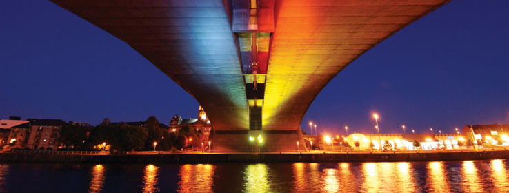
How have you used color in unexpected ways?
On a bridge over a river in Glasgow, we created two color montages that change based on the intensity of traffic, as well as the river's tidal currents. The traffic montage uses hot colors related to combustion, fire, heat; the river pattern uses cooler colors. So the choices are intuitive, but not the paint-by-numbers of "red equals Valentine's Day."
How do you hope people respond to your installations?
I have some of that old '60s idealism. I want people to find my installations joyful, interesting and thought-provoking all at once.
What colors do you find yourself using again and again?
Ever since I was a young lighting designer, I've always gone back to lavender and green. They're the perfect two colors. The combination makes me think of an iris. And they're versatile: Lavender is cool when it's next to warm colors, and warm when it's next to cool colors.
What colors do you have in your home?
I live with birds, and they're very, very green – iridescent.
What colors do you wear?
My goal is to only wear things with light properties: clothes that are iridescent, opalescent, metallic.
What advice do you have for people trying to introduce color – either via lights or pigment – into their design?
In order for color to work, you first have to have no color. You need a neutral to create something special. There's a moment of neutrality, which then moves into something spectacular. But nobody wants a surprise over and over and over – you can't hold a kaleidoscope up to your eye all the time!
You need relief. Be highly selective. Then be really passionate where it counts.
How do other design elements influence lighting choices?
Remember that materials and lighting are interactive with each other. For example, when you are using translucent materials, heighten that characteristic with illumination as a backlight. To intensify colored objects, finishes and wall coverings, make sure to use bulbs that are similar in color temperature to the predominant pigment color. For example, fluorescents come in cool and warm white – therefore, choose warm fluorescents for warm colors. Incandescent lamps become even warmer gold when reduced by a dimmer. Cooler lighting – in fluorescent and metal halide for commercial applications – will intensify blues and greens, but will also tend to lend coolness to the ambience. Sometimes you will want to create a warmer atmosphere around a seating – or "people" – setting, and a cooler atmosphere around the perimeter.
What's your biggest color pet peeve?
I was at Rockefeller Center the other day, and the fountain was pink. It looked awful. I'm not against whimsy – this just didn't feel planned. It felt like someone said, "Well, these electronic lights will do this, so let's set it on automatic."
In other words, don't just use color because it's there.
Right. Create an internal logic as the basis of your color palette. Whether it's on a wall or in your mood lamp, the beauty will arise from that inner logic.


