Close

Encouraging your client's self-exploration when choosing colors.
As a designer, you know that when it comes to selecting paint colors for a client, your approach is often multifaceted. You rely on your experience and instincts, you apply a bit of color theory or color psychology, and you layer-in your client's preferences. Then there's the space itself – you assess the lighting conditions, the architectural features and the existing furniture.
Your overall strategy should be in sync with your client's goal, of course, but what if that goal is based on a unique, very personal point of view? I've realized that when people are willing to trust their individual feelings regarding color, their beliefs will drive the selection process, even if that means going against the so-called color rules.
For example, color psychology suggests that when we see the color red, our heartbeat quickens, our blood pressure rises, and we feel alert and excited. Therefore, if you're pondering colors for a client's bedroom, you might avoid suggesting the color red. Then again, you may have a client like Matt Webb, whose Chicago apartment caught my attention after I saw photos of it online.
Webb painted his master bedroom red about two years ago. Being a graphic designer, he probably has more color knowledge than someone with no art training, but Webb says he carefully debated his decision. "It's a deep red, not a crazy bright red," he explains. Still, I'm sure that some designers would say that any variation of red is not conducive to rest and relaxation. That's where Webb would disagree.
"To me it's pretty calming," he says. "I have a lot of red pieces, and I like the contrast of using a vibrant color and pairing it with white." While Webb designed his apartment on his own (he also painted his bathroom a very vibrant orange), he does recall the words of a former teacher. "I had a color theory teacher who said that red is a great color for the bedroom because it inspires warmth and passion."
That's exactly how I feel about red, and I love Webb's space, but I'd probably have a difficult time falling asleep in a red bedroom. In hindsight, Webb says that even if a designer had been opposed to his bold color choice, it wouldn't have made a difference. "I still like it," he says.
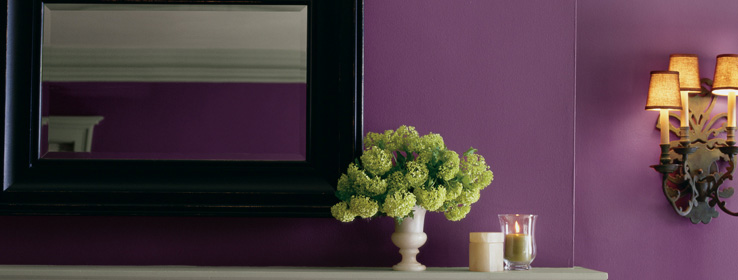
I respect his feelings because I've learned that color can represent something different for every person. Color can also give meaning to someone's place in life. Recently, I had a client who was newly divorced and preparing to paint the main level of her new home. We created a palette using a handful of lively hues. Although we discussed using a neutral "grounding" color for the foyer, she decided on a deep shade of violet (Aged Wine SW 6299) instead. My client told me that, normally, she'd have gone with colors that were considered "safe," but this was her house now and she no longer had to conform to a husband's taste. She wanted to embrace the colors that she liked. I got the impression her color choices also represented her new state of independence.
Everyone has an idea of which colors look harmonious together. As designers, our job is to help our clients discover just what that combination looks like. In the book All About Colour, Janice Lindsay writes, "Colour harmony is as unique as we are. Just as we know what smells and tastes good without anyone telling us, we know what looks good." This is important because many people tend to shy away from colors that seem to deviate from the norm, even when that means dismissing the colors they really love.
I once provided design services to three women who lived in the same neighborhood. As it turned out, the interior of each client's home had been painted with very similar colors. Apparently, the woman who painted first had set the tone for what was "stylish," and the other two ladies followed suit. Perhaps they had a fear of not fitting in or not having the proper "taste" had they done something different.
Choosing your favorite colors sometimes means standing firm despite what others say. When my "Lilac, Aqua & Brown Home Office" appeared on apartmenttherapy.com, the majority of the comments were very favorable, and then there was this one:
"I am sooo over aqua blue/chocolate teal & every variation thereof; in a few years this palette will be as ubiquitous & despised as the mauve, seafoam, aqua blue Myrtle Beach condo decor of the '80s."
A comment like this may have caused someone else to panic and repaint. However, I feel complete happiness knowing that my office reflects my personality and style. One evening when I was working in my office, my husband walked in, sat down, looked around and simply said, "This is so you." It then occurred to me: That's what I was going for. I want my office – and all my surroundings – to personify who I am. I believe that should be the ultimate goal for using color in a space – to reveal the personal side of whoever spends time there.


