Close

Kelly shares techniques for helping clients look at dark colors from a different perspective.
As a design professional, you know there are often elements of a project that require careful persuasion to get a client's approval. While it may be a challenge to convince a client to purchase a quirky lighting fixture or agree to an unconventional seating arrangement, it can be even more difficult to sell a particular color, especially one a client thinks is "too dark."
I learned this firsthand when I began offering color consultations. As someone who prefers deeper hues, it was natural for me to specify these colors. However, I found that many of my clients were placing these selections in the "dark"category. I started to think that perhaps I should suggest dark colors only if a client requested them. But that didn't work either because, it turns out, the word "dark" is very subjective. The colors I deemed light or mid-tone were considered dark by some clients. Not only did I have to re-evaluate my perception, but I also had to understand my clients' color fears and ultimately help them overcome their beliefs (often misconceptions) about deeper hues.
I found support for my position in a video produced by Sherwin-Williams that I used to teach color workshops. In one segment, designer Donald Bingham Schmitt says:
"There are people who will say you should never paint a room a dark color because it will make it feel small. You should never paint the ceiling a dark color; it will bring the ceiling down. There are rules and regulations like that, but they're not valid because if you use color advisedly, you can do anything."
Schmitt continues, "In my home, I have a black library and no one has ever walked in and said, 'Oh my God, I can't breathe! This room is so claustrophobic!' In fact, it's the opposite. They think they're in a really large room when actually, it's quite small."
Those liberating words gave me the confidence to explore people's resistance to darker colors, and then offer a different narrative. Here are three ways I've helped clients look at dark colors in a positive way:
Client Concern: Dark colors will make the room look smaller and feel closed in.
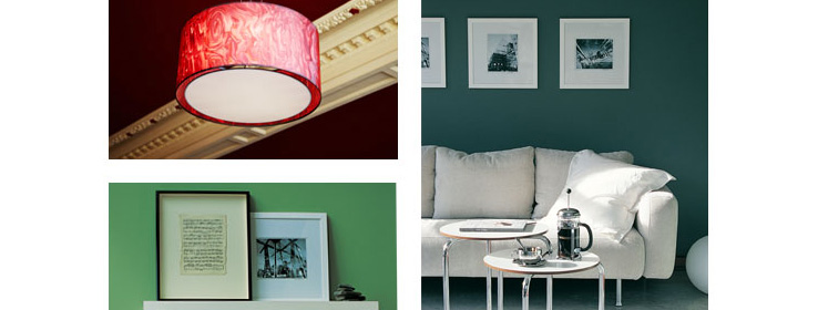
Positive Perspective: If you paint a 12' x 12' room black, the room will still measure 12' 'x 12'. Often it's not the color of a room that makes it appear smaller, but the amount of contrast and furnishings (for example, too many accessories; over-scaled draperies; large, bulky sofas). A dark wall color can help a space feel cozier and provide a greater sense of comfort, which is especially important in larger rooms or spaces with very high ceilings.
Client Concern: A dark color will make the room feel dreary.
Positive Perspective: Think of a dark room as you would a dark evening gown (or a little black dress). Then you can begin to see it as elegant, sophisticated, exotic. Take, for example, the Modern Glamour design style. The works of Kelly Wearstler and Mary McDonald exemplify the use of darker hues in this luxurious style. These interior designers are famous for using colors such as charcoal gray, emerald, indigo and black to create chic, unforgettable spaces that are far from dreary.
Client Concern: Dark colors are bland and dull.
Positive Perspective: Many dark colors look richer than their lighter counterparts. For example, chocolate brown appears more sumptuous than taupe. The same is true for claret, which looks more opulent than rose. Emerald looks ritzier than celery green. Paler colors can sometimes appear washed out, whereas many deeper hues are vibrant and can add energy and personality to a space, especially with a high-gloss finish.
With any dark color, clients should be aware additional steps may be necessary. The walls could require two or three coats of paint, and the room's lighting may need to be adjusted or upgraded. With these extra considerations in mind — and the dose of client courage it may take — enhancing a space with a darker color palette can make a striking statement and set a dramatic mood. And these are two of the greatest benefits of color.


