Close

BY KELLY PORTER
Considering the source and quality of light in a space is crucial to picking colors for it. The absence of light requires the same level of scrutiny.
As design professionals, we know lighting is a crucial element to consider when selecting room colors. Natural light affects colors differently than artificial light. Incandescent bulbs present colors differently than fluorescent and LED ones. And the absence of light and lighting is just as crucial to picking colors: Designers need to educate clients about how the lack of lighting affects a space.
Insufficient natural light is common in powder rooms, hallways, basements, rooms without windows and rooms that face north. These spaces present unique challenges when it comes to picking colors that won't get lost in the shadows. The solutions are fairly simple, even if they may seem counterintuitive. To help shed some light on the subject, I turned to two fellow color experts: Ellen Divers of Ellen Divers Color and Donna Frasca of Decorating By Donna.
The best solution to lighting and lightening up a room? Simple: Add more light. I went on to ask Divers and Frasca a few other questions that clients may be curious about when tackling a dark, shadowy room.
Q. What do you think is the biggest mistake homeowners make when choosing colors for rooms with no or insufficient natural light?
Divers: The biggest mistake is to follow the notion that you must paint the room a light color because light colors reflect more light. Yes, light colors do reflect more light, but if there is limited light in the room in the first place, then there's not much that's going to be reflected, and light colors can end up looking sad and gray.
Frasca: Some homeowners think they need to forgo color altogether in a dark room. There's this common myth that painting a small, dark space white will make it appear larger. That may work to a certain extent, but it can also result in making an already uninteresting room that much more uninteresting.
Q. Overall, what types of paint colors work best to enhance dark rooms? Divers: Generally, a dimly lit room means more shadows. Shadows will subdue any color you put on the walls. So you may need to compensate and choose a more saturated (brighter, more pigmented) color than you might for a better-illuminated space.
Frasca: Of course the saturated hues work best in any dark area. The cleaner the color (meaning the less black it contains) the lighter and brighter the paint color is. One hue that will brighten a dark room is gold, but you have to choose a "clean" gold such as Jonquil (SW 6674).
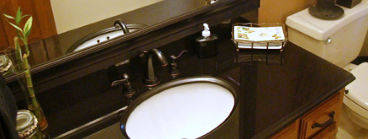
Q. What colors would you suggest for a powder room without windows? Divers: Powder rooms are great opportunities to do something fun and out-of-the-box. Usually, people aren't spending much time in these spaces, so we're not as concerned about the impact of color on their mood. Pick a color that pops, that makes you say "wow."
Frasca: While it depends on the bathroom, generally, I like to choose a dark or unexpected color, which you'd think would be the last thing to do, but it makes an otherwise hum-drum room stunning.
Q. What colors do you recommend for hallways? Divers: I say paint them any color you like, keeping in mind what we discussed about how colors behave in the dark. An interesting idea is to paint one wall darker than the other to create the illusion of a wider hallway. Since hallways are often narrow spaces, I would use caution with very bright, very pure colors because they have a way of "jumping off the wall" and making the space feel more enclosed than it really is. Medium values (not light, not dark) might be a good choice here.
Frasca: I almost always choose a light neutral for the hallway because these areas are often dark. Also, and more importantly, because they're often the main area of the home where many other rooms connect. There will be colors in those other rooms and if you choose a "color" for the hallway, there is no separation; the home can start looking like a bag of Skittles®.
Q. Gray is such a popular neutral right now, so homeowners want to use it in just about every room. What are your thoughts and tips about using gray in a north-facing room?
Divers: A room with northern exposure receives less light than eastern, western and southern exposures. It also has a bluer, sometimes grayer, cast. How does this affect colors? Cooler grays (blues, greens, certain violets) will retain their undertones because blue light blends right in with the hues. However, the undertones of warmer grays (like taupe) may be canceled out when cool light is reflected on them, making them appear grayer than they are. If you must use gray, choose one with a cool undertone and balance it with other warm colors in the room.
Frasca: I grew up on Long Island in a north-facing room and it was horrible! I eventually painted my room peach (don't judge me, it was the '80s), which helped out a lot. Personally, I don't think I'd use gray in a north-facing room. However, no matter what gray you choose, add a crisp bright white ceiling and trim, and keep the flooring light and bright.
Here are some Sherwin-Williams color choices for darker spaces:
Ellen Divers
Donna Frasca


