Close

By Jackie Jordan
Picking the Sherwin-Williams color of the year is no small feat. Here I share my insights and process with you.
Here's a huge admission: I inwardly cringe just a little when someone enthusiastically asks "What's going to be the ‘hot' color next year?"
I get asked this question countless times throughout the year. I could give myriad answers, but it would take far more explanation than anyone would expect, much less want to listen to. Therefore, my typical response is: "Whatever color inspires you and makes you feel utterly satisfied is the hot color." Luckily, that's a completely true statement, if still a bit of a dodge on my part.
The "color of the year" for Sherwin-Williams has become a big deal: Each November, it's a greatly anticipated announcement that garners a lot of media attention.
Don't get me wrong. I absolutely love making this decision and I don't take the responsibility lightly. In fact, I deliberate intensely over my choice because I want it to resonate and have lasting value. So I thought I'd share with you some of the reasoning and insights I bring to the decision-making process.
To begin with, I always look at the latest Sherwin-Williams colormix™ forecast palettes, because exhaustive research, scrutiny and validation went into choosing those 38 colors. I then seek out the colors that are the storytellers and separate them from the hues that, although important to the overall picture, play more of a supporting role.
So what is a storyteller color? It's a hue that evokes an emotion, depicts a mood, is emerging in new product rollouts and has endless possibilities. It's a color that can be the hero in a space or set the stage for others to follow. It's a color that's being driven by our desires, our lifestyles, our mindsets and our inspirations. Personally, I must have complete conviction that the hue I choose for the color of the year has longstanding potential and appeal.
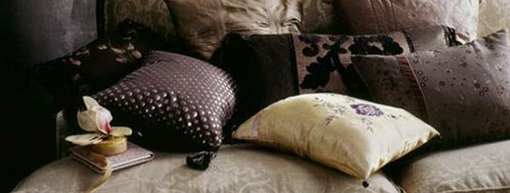
For these reasons and more, I selected Exclusive Plum (SW 6263) for 2014. We're craving a complex, adult purple that's both mystical and curious. A sophisticated hue that evokes elements of romance, drama and playfulness. Exclusive Plum has enough gray to ground it — to keep it from looking either too girlish or too overpowering — yet has a depth and saturation that can take it in many different directions.
Exclusive Plum can be paired with pale grays, whites and touches of cool metals for a sophisticated yet comfortable mood — perfect for a living room or bedroom.
Exclusive Plum is great mixed with the warmth of copper — a metal that's trending heavily right now — for a palette that's perfect in a rustic kitchen. Think copper pots and exposed plumbing fixtures. A color that represents aged copper nicely (and just happens to be January's color of the month) is Antiquarian Brown (SW 0045).
For a masculine space, I envision Exclusive Plum paired with rich leather furniture, warm wood tones, and touches of rust and muted green. For a space with a more lively personality, mix it with bright tones like magenta, chartreuse and pumpkin, or set a regal mood by pairing it with jewel tones.
Consider this color with an open mind, explore and experiment to discover its endless potential, and then, perhaps, you'll fall as passionately in love with it as I am. It may even become a staple hue in your design palette.
If you need a little more convincing of Exclusive Plum's loveliness, check out my Pinterest board devoted exclusively to this Sherwin-Williams color of the year.


