Close

Kelley extends a challenge: Stray from the traditional neutral safety net and embrace color.
Beige. Taupe. Sand. Tan. Cream. White. Designers and homeowners alike rely heavily on these neutrals to act as the base to their interior color palettes. For all intents and purposes, neutral colors will always be a mainstay. I myself cannot and will not promise to abandon them. They can be beautiful, soothing, even stunning.
However, I also believe that designers — both residential and commercial — and their clients can and should break from the mantra, "When in doubt, choose a neutral." We can stray from the traditional neutral safety net and embrace the "new neutrals": values of yellow, orange, red, blue, green and purple. There are ways to appropriately use just about any color of the spectrum in place of the standard neutrals.
When selecting an interior color for his vintage 1922 home, Al Bragalone, principal of MNID & Associates in Seattle, Wash., chose a vibrant yellow glaze. "Due to the lack of light and the overcast days in Seattle, I needed retinal stimulation. I wanted a very bright and exciting color to provide that," says Bragalone.
For the rest of the interior, Bragalone layered colors and textures that worked with the wall color. Silks offered a similar reflective quality to the glaze, while different values of complimentary colors — including teals, fuchsias and corals — along with lots of warm, polished woodwork, anchored the overall look.
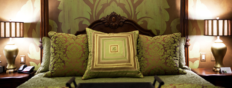
Layering multiple colors in a space is easy with a neutral palette, but becomes a little more challenging when your base is more colorful. A common problem: competing values of the same color. "Often, clients can't tell what's wrong with their space, but they know it doesn't feel right," says St. Louis—based interior designer Kimberly Reuther. The solution: "Balancing colors will help make the whole room feel cohesive rather than overwhelming. If the largest piece in the room — be it a piece of art, a sofa or the walls — is a bold color, it's important to balance it with a complimentary color or colors: in rugs, chairs, an accent wall or accessories."
Keep in mind, balancing color does not necessarily mean matching bold for bold. I once walked into a room that had so much going on, and all of equal intensity, it literally gave me a headache. That's why, when creating more colorful palettes for your clients or for yourself, the tried-and-true standard neutrals still play an important role. Often, incorporating the creams, whites, tans, grays and browns is critical to creating that harmonious balance.
Another thing to remember when using bolder hues is the saturation level. "Many people choose overly intense colors for their walls, especially in kids' rooms. If there's no variation in Chroma, the transition between multiple boldly colored rooms can be jarring and tiring for the eyes," says Reuther. "I recommend using hues that have a gray undertone, which creates a softer, more soothing color palette that's easier to live with for a longer period of time."
Bragalone agrees: "When choosing bolder colors for a space or an entire home, it's important to remember the whole. A color concept has to be consistently and carefully planned and strategically placed. The goal is to create unique vignettes for each space that work with each other rather than fight against each other."
A few of my favorite colorful pairings include:
- Dovetail (SW 7018) with Solaria (SW 6688) and Honorable Blue (SW 6811) or Tradewind (SW 6218).
- Alchemy (SW 6395) with Gala Pink (SW 6579) or Impulsive Purple (SW 6832).
- Naval (SW 6244) or Indigo (SW 6531) with Outrageous Green (SW 6922) and Forsythia (SW 6907) or Kid's Stuff (SW 6893).
- Holiday Turquoise (SW 0075) and Chartreuse (SW 0073).
- Raucous Orange (SW 6883) and Quietude (SW 6212).
Colors to try:
Rockwood Terra Cotta (SW 2803)


