Close

While color is just one of many factors to consider in restaurant design, it's one that can seriously affect the success of a business — and the pleasure of a diner's eating experience.
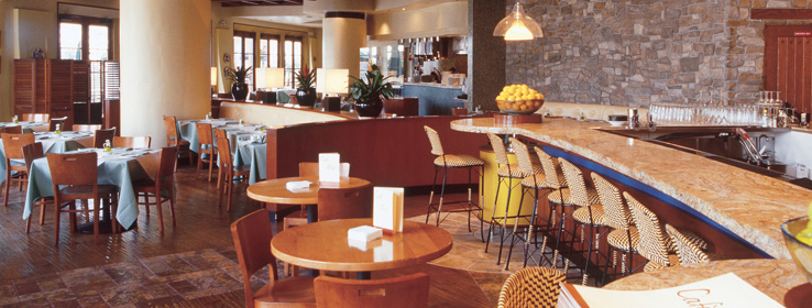
The success of a restaurant depends on more than just great food – a restaurant's environment plays a large role, too. And while many factors play a part in the visual design of a restaurant – textures, patterns, layout, furniture, lighting, style – color is the critical component that's relevant to all of these. It can affect diners' moods, the servers' appearance and, most importantly, the presentation of the food.
I stumbled on an intriguing paper online by Harold H. Alexander entitled "Restaurants Up Front," which explores the "visual and functional design of restaurants, factors that strongly affect customer reactions," including the effects of certain lighting and colors. This paper got me thinking about all the different establishments where I've had exceptional dining experiences – from highly stylized five-star restaurants to haphazardly assembled, hole-in-the-wall eateries. What were the predominant colors in these places? Palettes of yellows and earth tones color my memories. Why? Because most yellow hues evoke warmth and happiness. Warm light makes people and food look great, and it complements the predominantly brown and green tones of food.
The choice of hues has a huge effect on a restaurant's environment, as does the values of those hues. As Alexander mentions, "Light walls will give the illusion of a larger and more airy interior than if the walls are dark." But if taken to an extreme, a value that's too light may feel stark, cold and antiseptic – a cafeteria ablaze with bright white walls and flickering fluorescents, for example. It's certainly not the response you want to evoke in would-be diners. And while darker values often make a room feel smaller, depending on the hue and lighting, that can be a good thing – a cozy and inviting environment – or conversely, a bad thing – a cramped and claustrophobic one.
Blue in a restaurant setting can be tricky. For many, Howard Johnson's "diner blue" may evoke nostalgia €“ and even a craving for comfort foods. But a blue that takes on gray, green or yellowish undertones sends me into a state of depression. This past summer, I visited The Louvre and took a break in Café Richlieu, one of the museum's many cafes. This tiny room was awash in a dull gray-blue hue with an accompanying dark gray carpet. The yellow plates and red napkins clashed horribly with the interior. The waitstaff was dressed in black, which only made them look drab and seem to disappear into their surroundings. And yet, the space itself was grand for such a small footprint, with lofty ceilings and an impressive picture window. If only they'd chosen a more harmonious color palette, it would have vastly improved the space and my dining experience. As it was, I couldn't wait to leave.
Share with me a truly memorable dining experience – good or bad – and the environmental factors that made it stand out.


