Close

When the principal of an elementary school wanted to create a more stimulating school environment, the team at Design Lines Ltd. lent a helping hand.
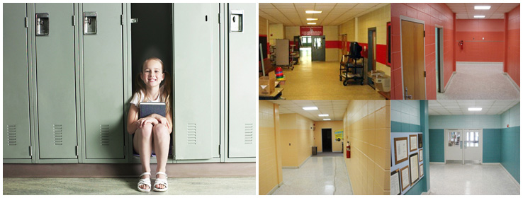
Large stripes. Brash colors. Dim lighting. When Creedmoor Elementary School (CES) principal Christopher Elliott looked around his North Carolina school, what he saw was in stark contrast to what he wanted for his 570 students.
"There's environmental research on what impacts learning," says Elliott. "And here we had very little flow, and walls with mismatched paint. Some of the spaces felt almost institutional. I wanted to make it better."
Thanks to a contract between Sherwin-Williams and the North Carolina public school system, making it better was a definitive possibility. After Elliott learned he could buy Sherwin-Williams paint for his school at a discount, the enterprising principal reached out to several local interior design firms in search of a fresh design, pro bono, for CES. Raleigh-based Design Lines Ltd. was thrilled to answer the call.
Inspiration Everywhere
Elliott met with Brittany Ruch, Allied Member ASID and Design Lines' lead designer for the CES project, who created a plan to transform the school through a livelier, warmer, more inviting color palette. She and the Design Lines team presented a balanced scheme of earth tones and contemporary, upbeat hues to appeal to both children and adults.
Explains Hilaire Pickett, director of communication at Design Lines, "The thought behind the new paint colors was that we wanted kids and staff to walk down the hallways and feel happy and positive. Brittany took inspiration from the school's surroundings, from a Lincoln Log photo she'd seen in a 2008 Dwell magazine and even from some fun images from a CB2 catalog."
Images provided by and used with the permission of Design Lines Ltd.
Adds Principal Elliott, "Our school is in a woodsy setting, so having colors that work with the outdoors is great. Parents, kids and teachers all respond well to it."
Light and Bright
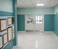
Color was used not just to create a more cohesive look throughout the school, but also to identify spaces. For example, the art hallway is a juicy mango hue, and staff can now give directions such as "follow the blue" to find a grade or classroom. Ruch chose to color-block the halls, painting the lower two-thirds a darker tone and topping that with a lighter one. The design creates an active feel while also giving students a sense of ownership about the spaces with which they're most familiar.
During the CES makeover, which took less than two months from concept to completion, Elliott was hands-on in a way few principals get to be. Not only did he personally repaint the school stage, he also led the charge in installing more natural lighting throughout the building. "I was literally putting in light bulbs minutes before our open house," says Elliott. "And now we see that the paint, the new lighting – everything has made such a big difference."
Some might even call it inspiring. CES's current project? Revitalizing the look of the large, plain sculpture at the school entrance. With help from art teacher Leslie Nunnery, the sculpture is starting to shine with a colorful work-in-progress: a mural painted by each and every student.
Sherwin-Williams Hues
A range of Sherwin-Williams colors, in tones both soft and cheery, were used in the Creedmoor Elementary School makeover. Here are a few favorites:
Tony Taupe SW 7038
Aesthetic White SW 7035
Ambitious Amber SW 6366
Cachet Cream SW 6365
Notable Hue SW 6521
Hinting Blue SW 6519


