Close


Our guest designers tackle the question of what our color palettes today will say about us 100 years from now.
Every era is colored by a palette that sums up the times, tells the human story and secures a page in history. STIR® invited four architects and interior designers to gather around their respective computers for a keystroke conversation about the directions spinning today's color wheel and how the hues prominent now might be perceived in the next century.
We're grateful for the musings of Dale Mulfinger, co-founder and principal of the Minneapolis firm SALA Architects and author of three books on cabins for Taunton Press; Leslie Shankman-Cohn, proprietor of Eclectic Interiors in Memphis and an interior designer devoted to "aging in place, aging in style"; Karin Schluer, a LEED-certified interior designer and owner of Karin & Company, LLC, a Long Valley, N.J., firm specializing in high-end residential and commercial office design; and Abby Suckle, a New York City architect with expertise in civic, academic, residential and corporate projects.
STIR: How would you describe today's prevailing color palette?
KS: Nature and natural forces continue to have strong influence as consumer awareness about the importance of preserving our environment grows.
AS: It's far simpler to create a building that looks "green" than it is to get LEED-certified. Not a lot of people know how to achieve actual sustainability. In truth, a sustainable product could very easily be shocking pink, but it just doesn't feel right.
DM: Although nature really carries all colors – pink lady-slippers, white snow, black taconite, lime-green praying mantises – we probably all think of natural colors as rich, more subdued hues.
STIR: So "nature-inspired" will be viewed as this period's color banner?
KS: Nature and nostalgia.
LSC: Nostalgia, yes. The hot pinks, lime greens and aquas within today's prevailing earth tones and spa hues are reminiscent of 1950s and 1960s retro looks.
DM: The force is sometimes referred to as the Dwell/IKEA "Design Within Reach" syndrome, where a return to 1950s style and color is in vogue. Every month Dwell magazine gets thicker, while Architectural Digest gets thinner!
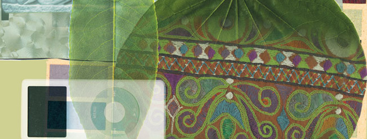
AS: The colors are not quite the appliance colors of the 1950s, but updates. You see pungent avocados, persimmon oranges, pumpkin yellows, and beiges set against silver turquoises or walls of glass. Rem Koolhaas has a cleaner, fresher-looking orange. Avocado is a more acid green. But we're not 1950s post-war suburbia. We're the era of the Internet, e-mail, the BlackBerry, iPods and computer-aided design; of reality TV, HGTV and extreme makeovers. We've just acknowledged the reality of global warming and tsunamis, Hurricane Katrina, $70-plus barrels of oil, and sustainability. I really think the colors of this era will be the clean/natural palette.
DM: Regardless, we'll be recorded as a culture that was willing to use color on everything except exteriors. If you look at mass housing, you'd say today's palette is beige. We're still timid there and haven't found too many ways to keep intense color from fading.
STIR: What do these palettes say about our culture at this time in history?
DM: The beige of market housing says "fear of resale," which stems from our highly mobile culture. The richer, fuller palette of architectural housing speaks to consumer maturity and confidence.
KS:Clients are more confident. I've observed more color bravery in both interior and exterior design: splashes of bright colors in unexpected places, bolder blasts, more color saturation. Technology has had a great impact: We're increasingly aware of not only our surroundings but of our differences, too. As a result, we're becoming more multiethnic and color-educated, and accepting of a much broader palette.
LSC: The global information age is a historical first. Colors and trends are reflecting influences from all the world's cultures. At the same time, we have less social interaction aside from the disconnected discourse of the Internet. Our "spas" are now in our homes. Our shopping and entertainment are now done from home.
So we're more sophisticated because of technology but yet isolated by it as well?
LSC: The isolation isn't only technology. Faced with uncertain politics, we're looking for security at home. That mirrors the political climate of the 50s, which was one of the Cold War and fear, so people were nesting then as well.
KS: Nostalgia, with its familiar patterns and color families, creates an environment that we remember as safe and understandable.
DM: For its part, green equates to nature, making natural green hues one of the few safe places for us to hide against the onslaught of wars, global warming and the excess of consumerism symbolized by Hummers and Jet Skis.
STIR: Any crystal-ball projections on what will be influencing color 100 years down the road?
DM: The melting-pot society in which we live will get less Eurocentric and richer in color, with the broad palette of African, Asian and South American influences. I hope that our willingness to live with the rainbow of colors will reflect upon our willingness to coexist with the rainbow of ethnicities, races and religions. Either that, or we must all accept beige and "my" religion.
AS: You need only look at society 100 years ago to see how unpredictable things are. It was the beginning of automobiles, electricity, the Wright brothers and flight. No one had telephones or refrigerators, the first subways were being dug, women wore long skirts, and everyone wore hats. Art Nouveau was the "hot" style. Scotch Tape hadn't been invented, nor zippers or movies. If the palette was anything, it was gray with splashes of lilacs or rose, soft green and lemon. Things will change in 100 years in ways we can't even imagine.
KS: Change has always been a strong human desire. The color pendulum will swing from little color to excessive. Going forward, natural colors and materials will be viewed and used with the mix of colors they contain. The need for comfort, luxury, flamboyance and sparkle won't likely diminish.
LSC: The concept of biomimicry will come of age, and color will be in a state of immediate and constant evolution. Things will change with the weather or time of day, or by touch. There are already tiles that change color in these ways. Colors will help with our energy needs, somewhat like solar power or induction and convection. Think of a zebra's stripes: The dark and light colors create a temperature differential that creates an air current to cool the zebra. If we knew how this stuff would work, we could all be millionaires!
The Color Pendulum
Colonial Times. Immigrants emulate the American Indians' use of pigments from nature. Paint is a luxury; its use signifies stature, according to architect Dale Mulfinger.
Classical Revival Period. Affluent Americans send their offspring to tour Roman and Grecian classics, spawning a whitewashing of America. "White's seen as morally and hygienically pure," Mulfinger says. "I suspect that coal-fired industries and heating systems in apartment buildings were making our cities dark and dreary."
Victorian Era. Exuberant colors and their copious use herald the "arrival" of society's less-traveled nouveau riche. Even simple buildings were lavishly decorated and painted. "They were showing off and having fun," Mulfinger says.
Turn of the Century. White returns, calming the Victorian color frenzy. Americans become less certain that Europe holds all the answers, says Mulfinger, giving rise to the local sensibilities and native colorations of the Arts & Crafts movement.
The Great Depression. Colors become muddier and darker as financial struggles stretch on.
The 1950s and 1960s. Post-war development in the suburbs brings the beige cloud. With the robust economy stirring mobility, homeowners view houses as salable assets rather than personality-infused inheritances to bequeath. Modernists promote bright primary shades. The Vibrant, loud colors mirror a strong economy and prominent place on the world stage. The stock market dive mutes colors back down. Environmental awareness in the 1990s stirs interest in earth tones and natural hues.
1980s and 1990s.
This Century. After 9/11, homes become safe havens staged in soft, inviting shades.