Close


Muralist Chris Finefrock shapes large spaces and evokes emotion with color as her muse.
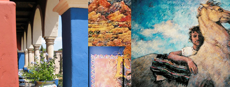
Color can make a vivid impression, informing design and evoking emotion. For Chris Finefrock, a muralist and art historian, using color on a grand scale is an exquisite opportunity to craft environment and mood.
For decades this prolific painter has been creating her distinctive works for homes, restaurants, and varied commercial interiors and exteriors. In every piece and every place, whether a historic residence or a Tex-Mex eatery, imaginative color play takes center stage.
"Making art is what I've always wanted to do, even as a child,” says Finefrock. A self-described fan of exuberant hues, Finefrock delights in using color to make a room or facade shimmer with feeling. "Very few people get to do what they love. I not only get to do what I love, I get paid to do what I love," the artist says happily. Today, having settled into her new studio in Sedona, Ariz., Finefrock talks with STIR® about her work, her artistic approach and the brilliant power of color.
STIR: Tell us a little about yourself as an artist. What is your background, and how did you get to where you are now?
Finefrock: After receiving degrees in fine art and art history, I worked as an art historian and consultant for the Smithsonian Institution and private individuals. Studying art history enabled me to acquire a knowledge of the art of other cultures and time periods; very useful as a muralist.
I have always gravitated toward working big, whether on canvas or directly on a wall. This, plus an innate love of pattern, led me to decorative painting for private homes, restaurants and large commercial spaces. I have always done easel painting in addition to my mural and interior design work, but murals are my first love, and I am working more in that direction now.
STIR: Where can people see your art?
Finefrock: I have murals in the Textile Museum in Washington, D.C.; the Oklahoma City Golf and Country Club; the Fredericksburg Country Club in Virginia; and restaurants and businesses in many states. I also have paintings in various collections worldwide, including Barclay's Bank Ltd. in London and the State Collection of the People's Republic of China.
STIR: What do you most enjoy about working in a large-scale medium?
Finefrock: I find that murals and large-scale paintings have a unique ability to transform a space in a manner that is generally not possible with smaller works. So the creative process becomes more than just creating a piece of art; it's about affecting the entire environment. Perhaps this is the connection to interior design for me, and the use of color in both.
STIR: Great point, Chris. You are both a muralist and an interior designer. Do you identify more strongly with one?
Finefrock: I tend to approach my interior design projects, including building facades, in the same manner as I would compose a painting. The same elements come into play: color, texture, scale and balance versus asymmetry. I suppose I consider myself an artist first, although I've been fortunate enough to have the opportunity to work on three-dimensional canvases, which are the ultimate challenge. And color, truthfully, has always been the primary element in both art and interior design. I'm a colorist through and through.
STIR: It came to our attention that you use Sherwin-Williams paints almost exclusively in your murals and commercial interiors. Why?
Finefrock: In the beginning, I began using Sherwin-Williams paint for decorative borders for a chain restaurant client that specified Sherwin-Williams for the wall colors, and it was just easier to coordinate border colors using the same palette. However, as I started to work with the products, I found that I really liked the consistency of the paint. And the abundance of Sherwin-Williams hues saved me a great deal of time that I would have spent mixing. For murals I habitually paint with white, black and the three primary colors. Sherwin-Williams hues are true and lend themselves well to mixing. So I can use them directly from the can for opaque work or dilute them for a watercolor or stained effect.
STIR: What is your process in selecting colors for a given project?
Finefrock: I speak with the client about how they want to think or feel in the space, or how they want their customers to think or feel. When choosing colors, I try to be conscious, but a lot happens at an unconscious level. I love color and I've been lucky to work with people who love color, too.
The emotionality of color is a lifelong interest of mine and particularly important for interior design, even more so in a commercial environment like a restaurant, which needs to evoke a certain impression or experience for the customer. I'm quite partial to the Mexican modernist architects who used color to evoke emotion: José de Yturbe, Luis Barragán and Ricardo Legorreta, to name a few favorites.
In addition to emotionality, I am fascinated by the interactive properties of color. Working with bold wall colors in a commercial environment creates a number of challenges. I once tried unsuccessfully to dissuade a client from painting the ceiling of a large restaurant green. Of course, it not only turned all the food a strange color, but the patrons as well. And, of course, it had to be repainted before the restaurant opened.
STIR: Do you find that you gravitate toward certain colors for the emotions they tend to evoke?
Finefrock: I tend to like to work with bold, strong colors - nothing subtle for me. The majority of my restaurant work has been for ethnic restaurants representing the cuisine of cultures that are characterized by the bold, exuberant use of color - Mexico, Spain, Greece, India and Cajun Louisiana, to name a few.
STIR: Are there certain colors that have special impact for you?
Finefrock: The colors I work with vary tremendously from project to project, but I do have a few favorites that stand out. Lupine (SW 6810) is an extraordinary, versatile blue that can be manipulated by surrounding colors to appear a rich gray, a French blue or a lush purple. Likewise, Jalapeno (SW 6629) is nothing short of magic. With the right lighting, Jalapeno can positively set a space aflame. I love to use it in areas that are visible through an open doorway. It can literally draw folks into a room. But a word of warning: It's not for the faint of heart!
Beth Rutledge is a Minneapolis-based lifestyle writer and Realtor® with an affinity for design, home décor and 1920s architecture.


