Close


The factors that play a part in picking colors for hotel lobbies.
When it comes to creating an appropriate color scheme for hotel lobbies – the first and often lasting impression guests have of the property – hospitality designers face an interesting challenge: Not only do they need to envision a welcoming space that meets the hotel owner's wishes, but their vision has to appeal to thousands of different hotel guests – with varying tastes and styles – walking through the door.
"Color sets the tone for how a person is going to perceive the space they're entering, maybe for the very first time," says designer Kenneth Walter of in Chicago. "And depending on the hues used, they may never come back."
Sheri Thompson, national director of the hospitality market for Sherwin-Williams, couldn't agree more: "I have the opportunity to visit hundreds of hotels a year. To me, the hotel lobby defines the personality of the whole hotel. When I walk through the front doors of a hotel for the first time, I take in all the details of the lobby – colors, textures, accents. I especially take note of the lobby colors because they set my expectation for what I'm going to find in other public spaces and my room. I know that if there are warm, bright or energetic colors in the lobby, then the whole vibe of the hotel will follow suit."
While each hotel lobby project garners its own unique color palette, Walter says that certain common hues work well across the board. "Light colors such as creams, whites and beiges work universally," says Walter, who considers green a neutral color because of its prevalence in nature. Thompson also believes neutrals are a good choice: "Neutrals can create a wonderful lobby experience, especially since today's neutrals are anything but boring – sophisticated browns, greens, grays and whites are all great colors to create an inviting canvas."
"In the right space, it's edgier to paint a wall black or brown, but there are a lot of hotel operators who would never stand for it," says Walter. "Reds can be very warm and enveloping, but they can also make people feel a little uncomfortable. It's all a matter of how much color you use and finding the right balance."
Asking the right color questions
Designers factor in several considerations when developing a hotel lobby, perhaps the most important of which is working closely with their client. "We have very extensive meetings with our clients in which we talk about their goals, clientele, and the vibe and feel they want," Walter says.
A good starting point is determining the overall concept of a project. "It could be the soothing colors of an oasis in the desert or more of a highly themed project where the owners want a Grecian palace-type space," says May Poon, senior project manager of Dallas-based design firm Wilson Associates. And as with any design project, the more specific the information, the better. "The client may say, 'We love blues and yellows,' and then we ask, 'OK, but exactly what shades of yellow and blue are you looking for?'" Both Gray & Walter and Wilson Associates specify Sherwin-Williams coatings for the majority of their projects.
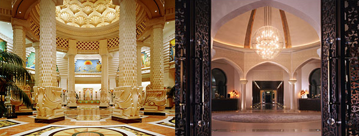
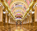
Wilson Associates recently designed several themed hotel lobbies. Poon worked on the Atlantis Bahamas and Atlantis The Palm in Dubai, both of which boast jewel tones to enhance the palace theme. Another colorful project, the Venetian Macao, showcases rich gold tones that imply opulence within the Italian-inspired hotel-casino. In addition, the design firm developed Park Hyatt Dubai, where a lack of color (white on white) brings a modern touch to the hotel's classic Middle Eastern architecture.
Location, location
Location can also play a role in determining a hotel lobby's design scheme. "For example, in the Middle East, there is very traditional Arabic architecture; therefore, we often use gold and other warm tones to complement it," Poon notes. Meanwhile, two of Walter's hospitality projects relied on their locale to determine a color scheme for the lobbies. For the Tremont House in Galveston, Texas, the client "wanted everything to be cooling because it is so hot there, so we used a lot of white, black and gray," Walter says. "The only other color we introduced was green." The other project, the Harbor House, also in Galveston, relied on its location near the Gulf of Mexico for a refreshing palette of blues, greens and celadons.
In some instances, however, a hotelier's brand standards take precedence, regardless of the location. As an example, Poon cites the in-progress Sofitel Dubai, which Wilson Associates is designing. "They want to bring everything French into the project – it's a very cutting-edge European scheme with influences from the fashion and design worlds," Poon says, noting that the lobby will feature geometrical patterns using stark white, warm gray and a slightly darker shade of gray, all accented with pops of orange. "But even for clients we know very well who have a very specific color identity, we'll always try to do something different."